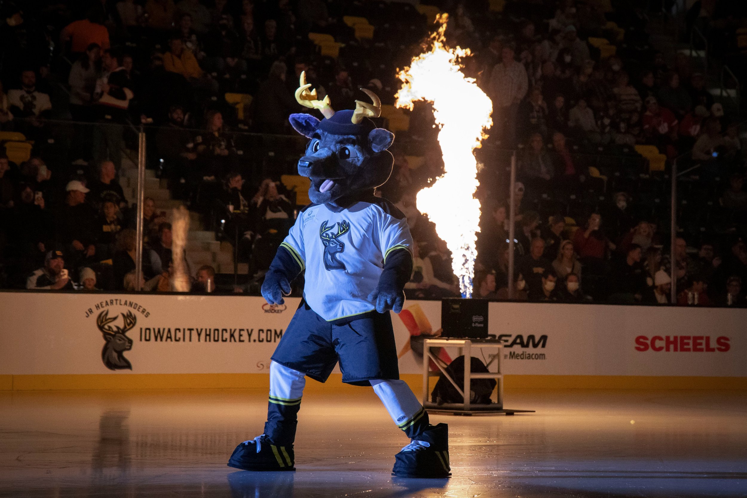
Iowa Heartlanders Brand Identity
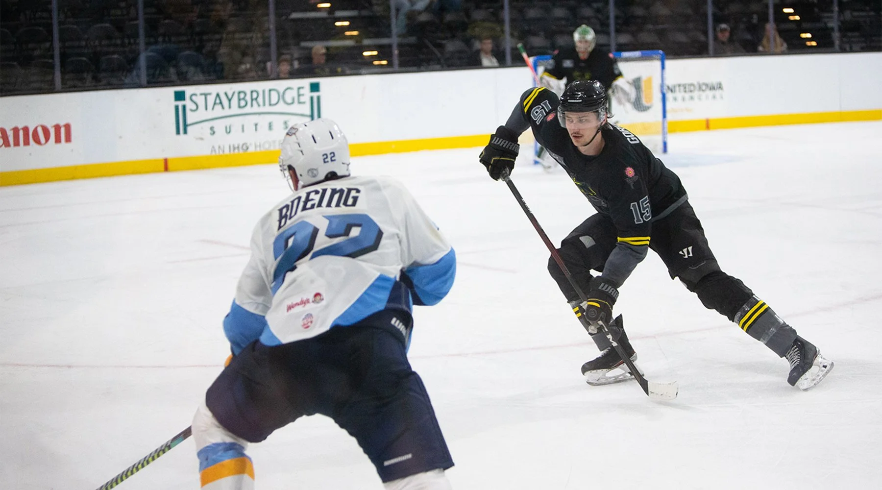
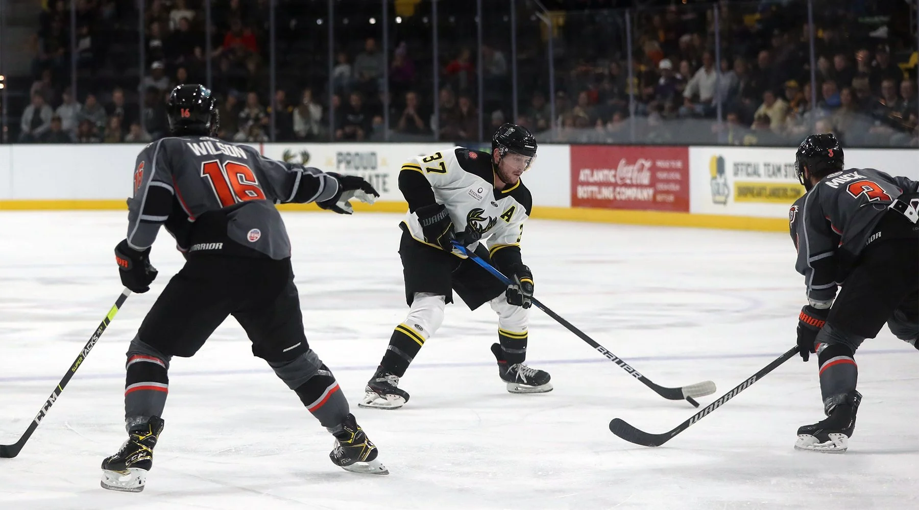
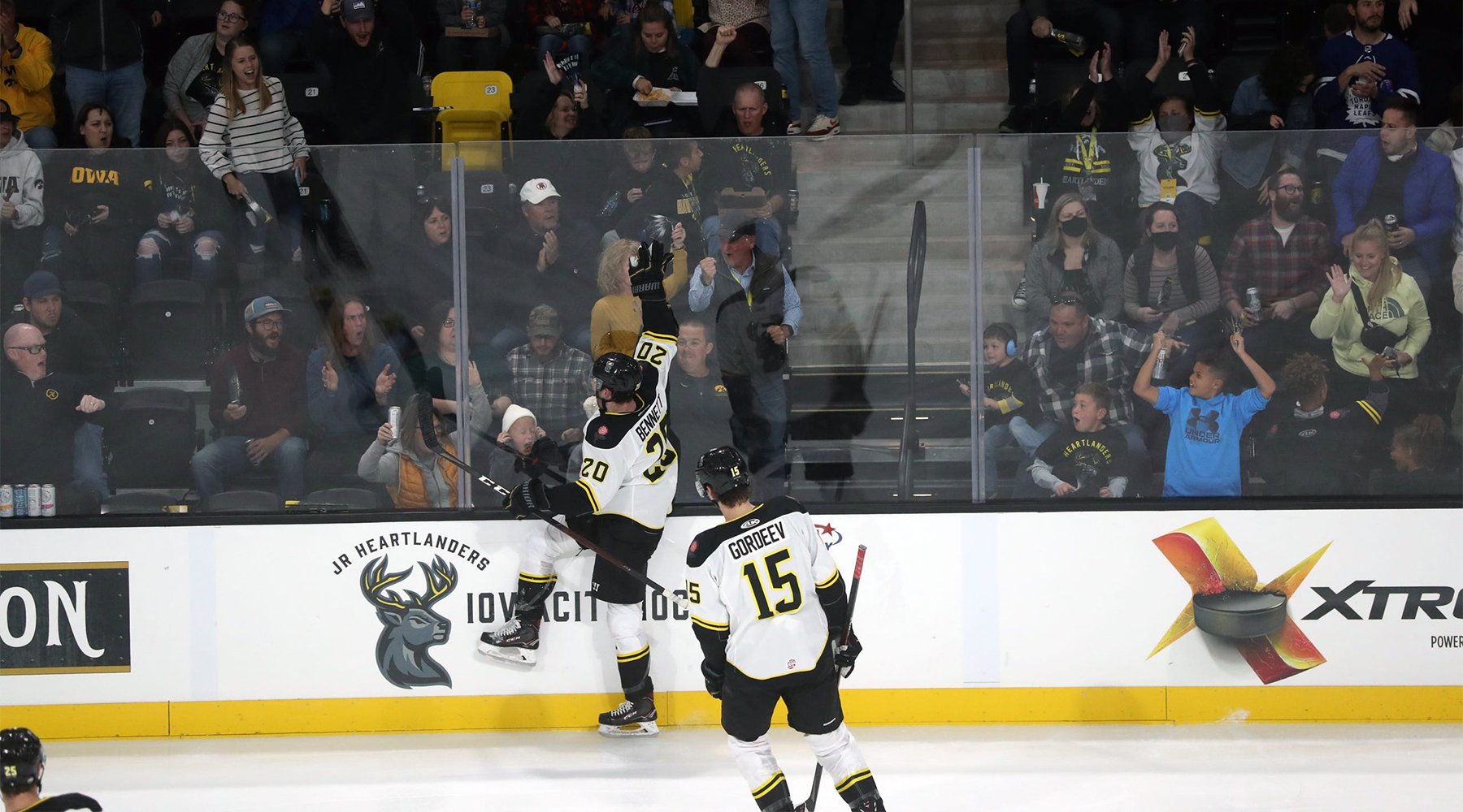
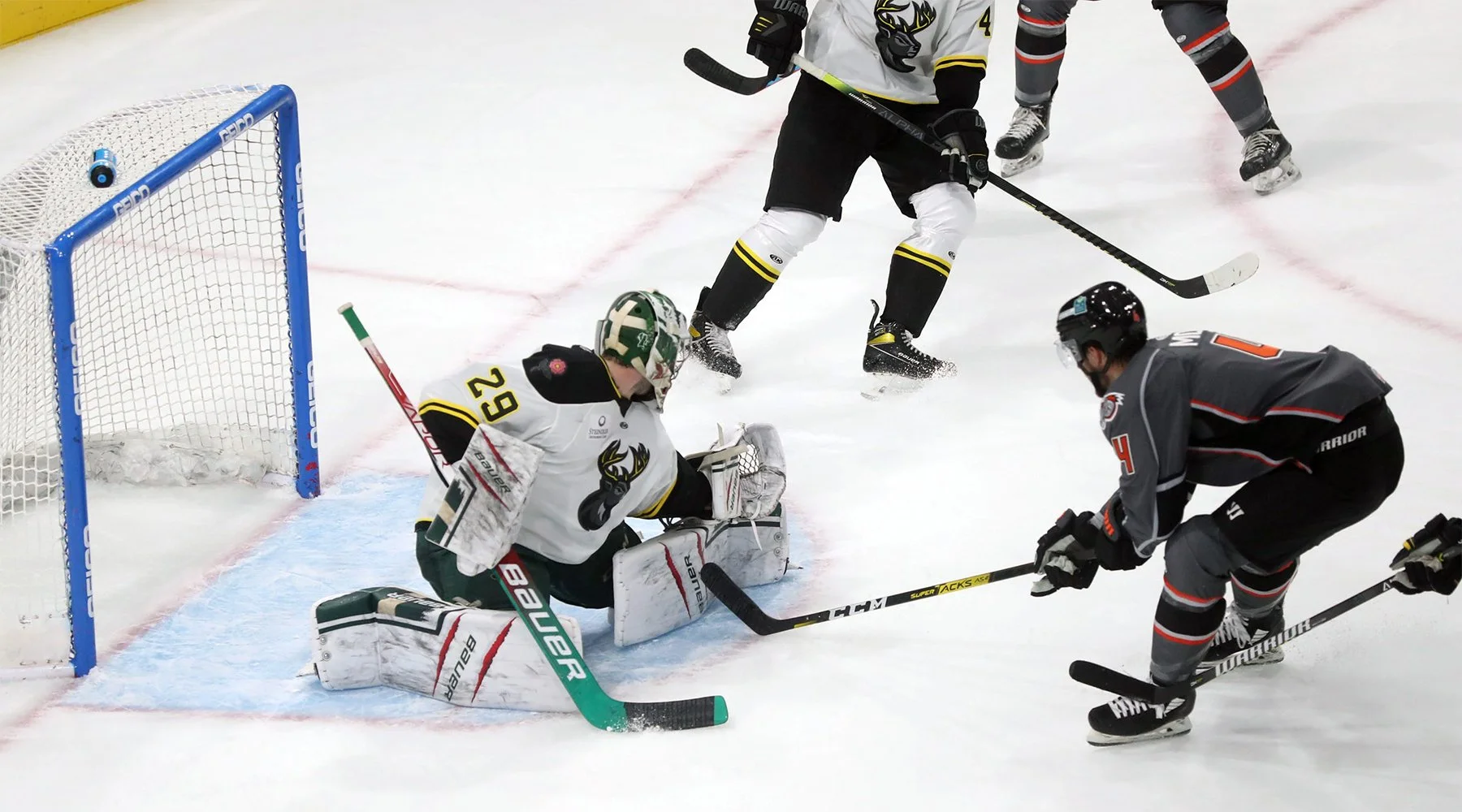
RUN THE GAME
Scroll ↓
PUTTING THE “HART” IN “HEARTLAND”
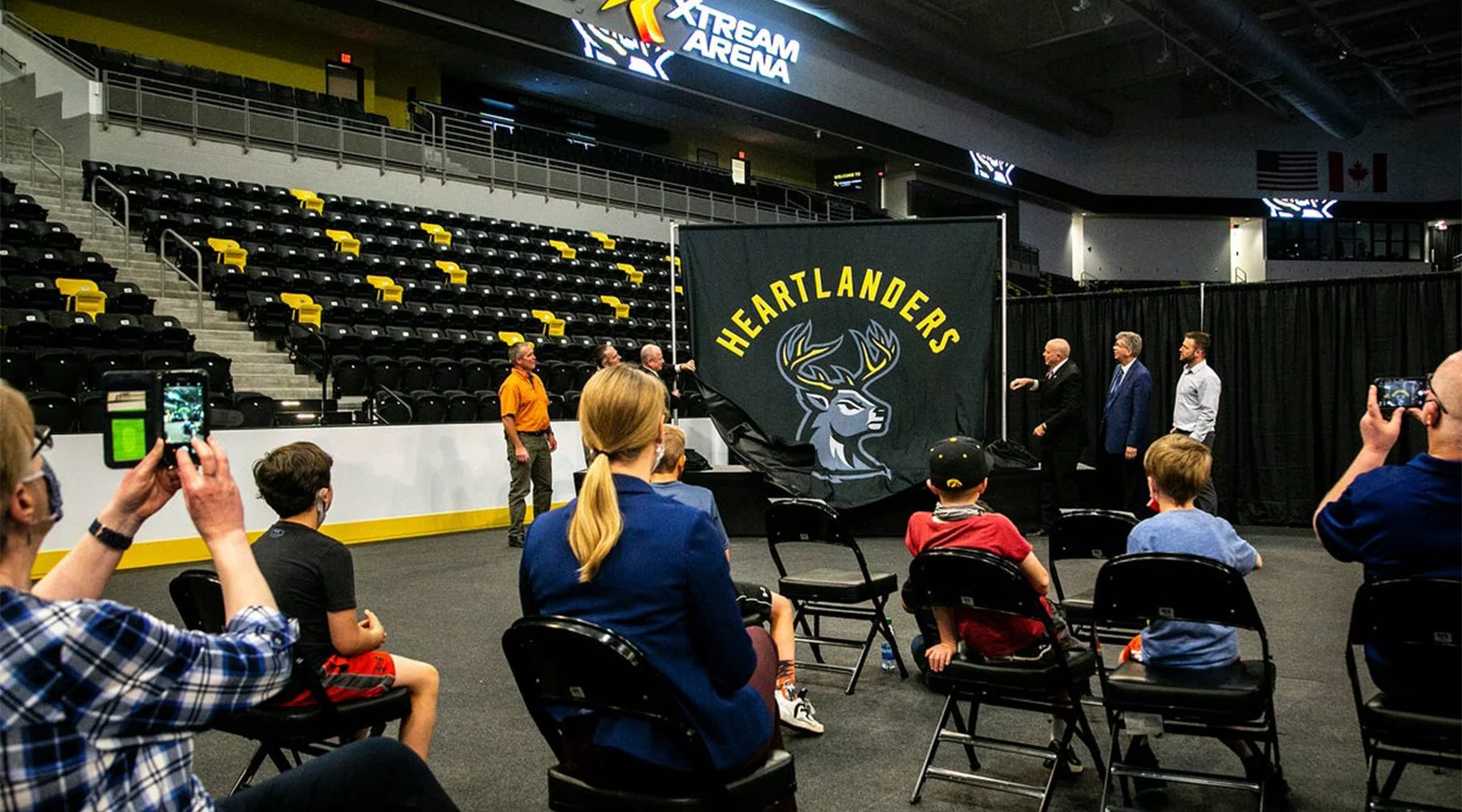
In December of 2020, Deacon Sports & Entertainment contracted me to create the identity for one of the organization’s new ECHL franchises, the Iowa Heartlanders.
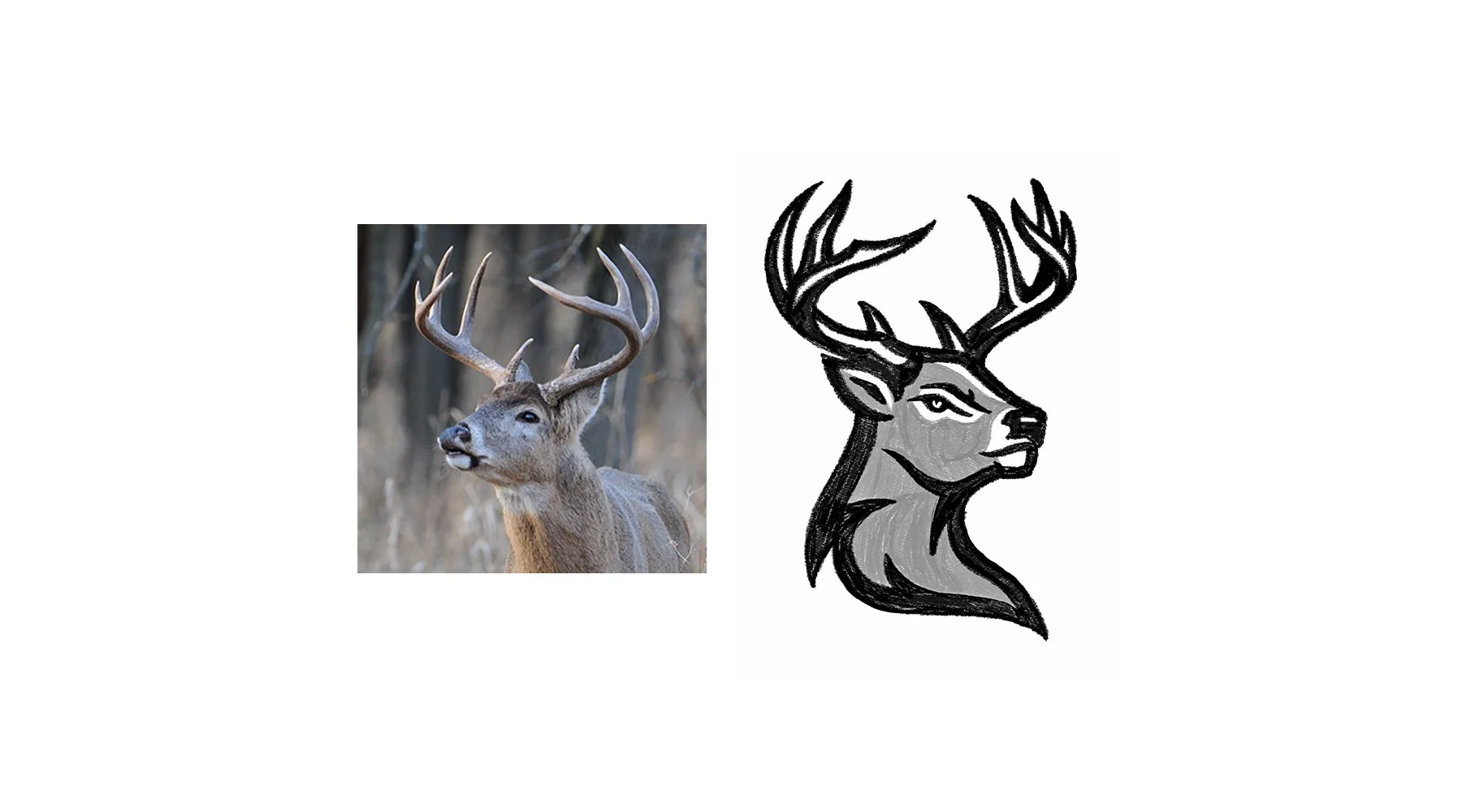
The team’s goal was to create an identity that would really strike a chord, not just with fans in Iowa, but in the wider area of America’s Heartland (the basis for the team’s name). After conducting a thorough research phase, we settled on a white-tailed deer to represent the team. The team wanted something unique and unexpected, creating a connection to their home, values, and traditions, that wasn’t on the beaten path.
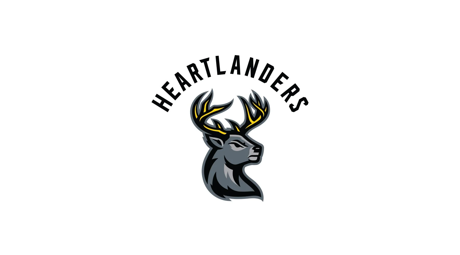
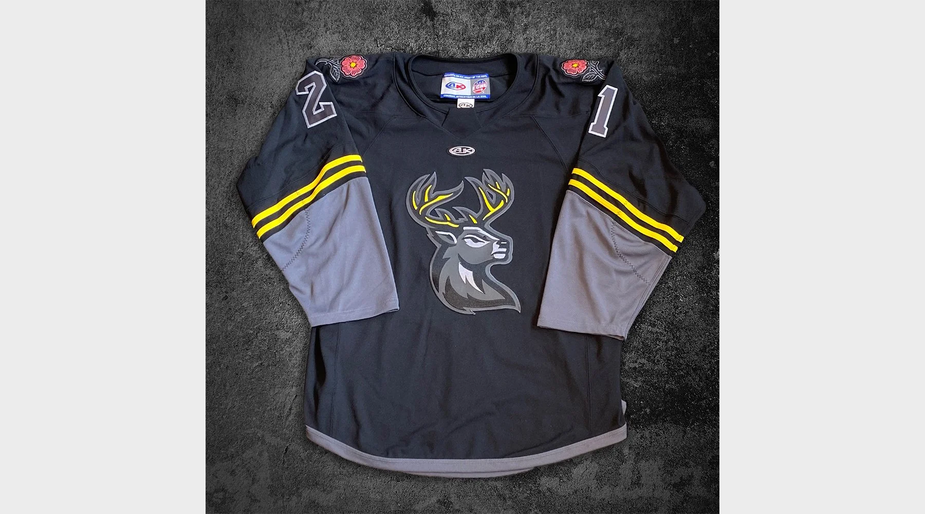
Born from the hunting tradition that is so engrained in midwestern life, the buck represents the elusive prize that is so sought after, and comes with great respect from those seeking it. As so well stated in the team’s press release, “the antlered crown, adorned in sunrise gold, makes it known that we are the mighty kings of the heartland. For victory against foes, a gold crown is earned, not given.” As a small bonus, the old English word “hart” means “deer,” lending to us a pseudo-play-on-words for the name.
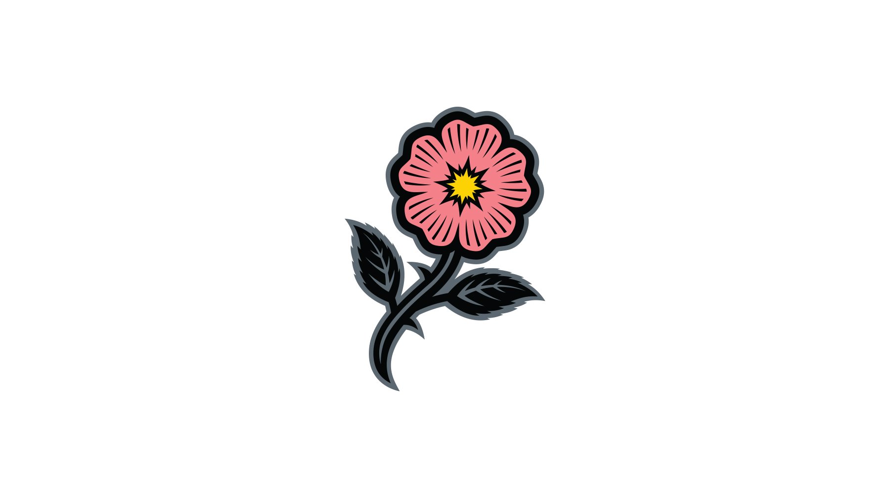
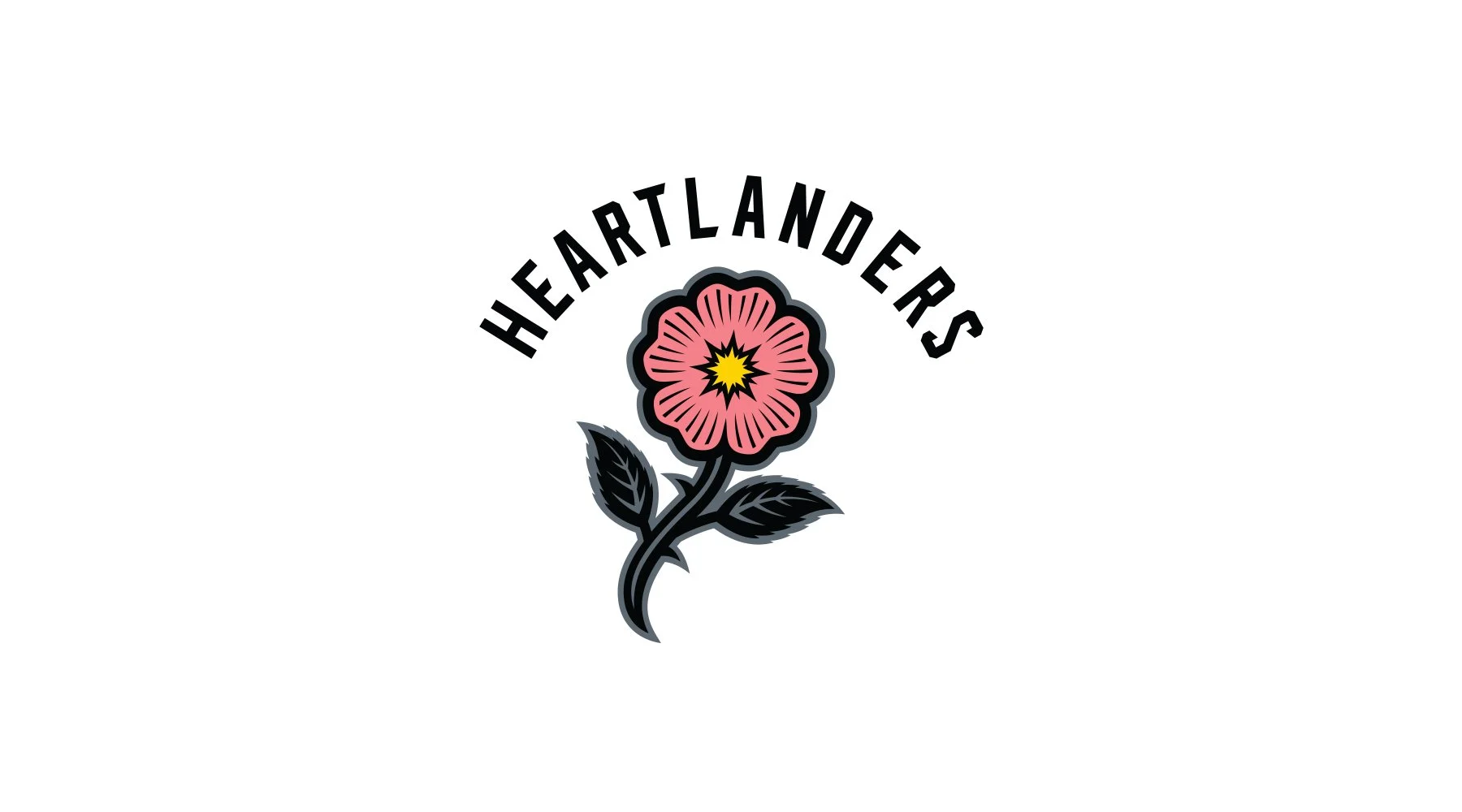
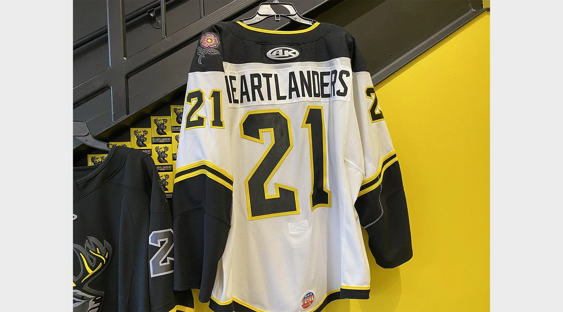
The secondary logo features a wild prairie rose, the state flower of Iowa, rendered in coral pink to represent the team’s home in Coralville, along with the center portion representing a shining sun that is so crucial to the agricultural success of the region.
Finally, a custom typeface was designed for the wordmark and uniform letting and numbers, based off of vintage license plates from the state of Iowa.
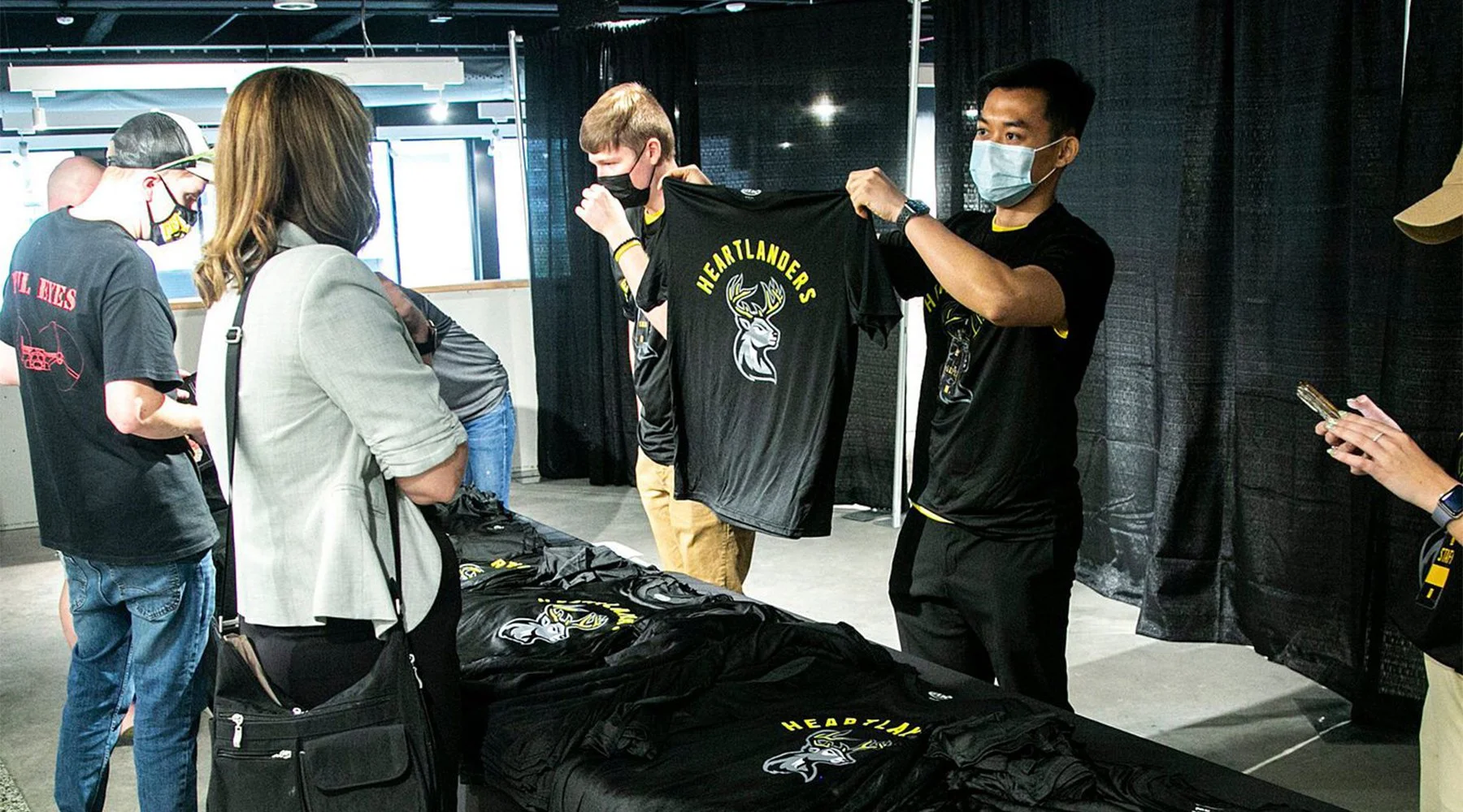
The Heartlanders took to the ice in the fall of 2021. For more, visit IowaHeartlanders.com