
Frontier League Rebrand
NAVIGATING THE NEW FRONTIER
Scroll ↓
ONWARDS AND UPWARDS
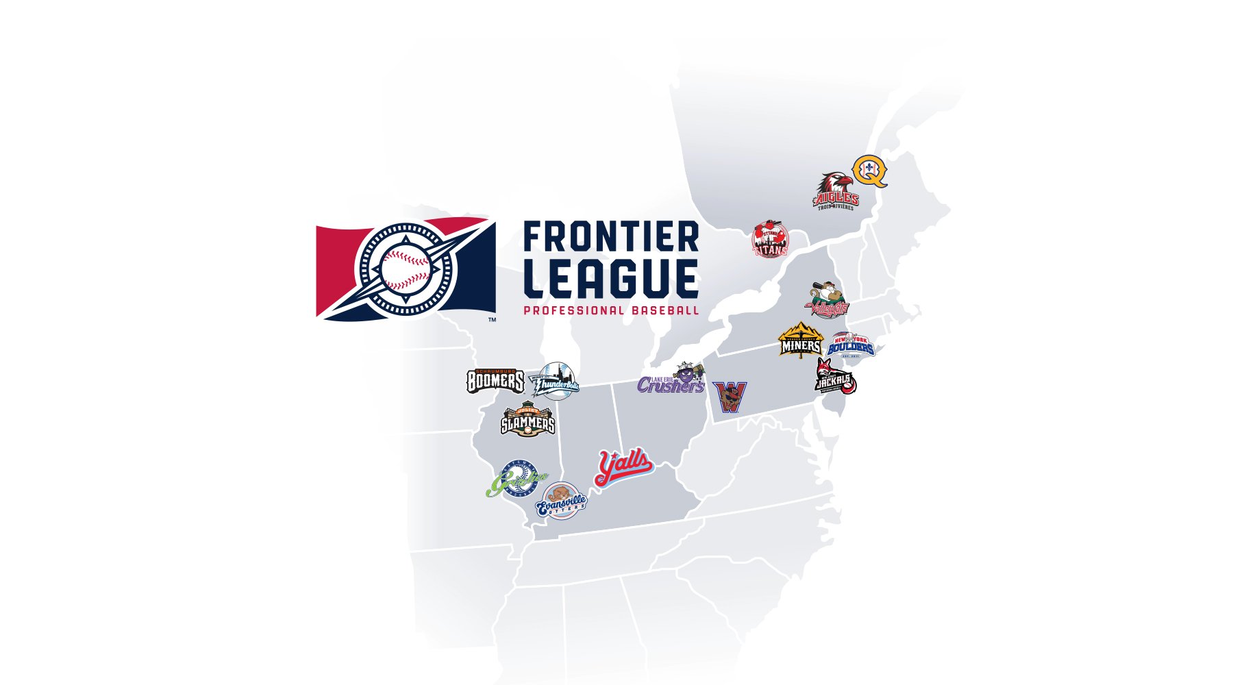
In early 2022, the Frontier League reached out to create a refreshed brand identity. The league wanted to create something more professional, more modern, and something that represented its core values to its member teams and to its players.
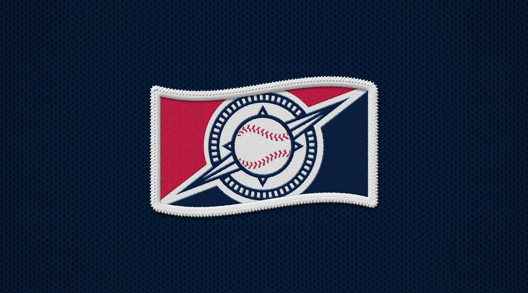
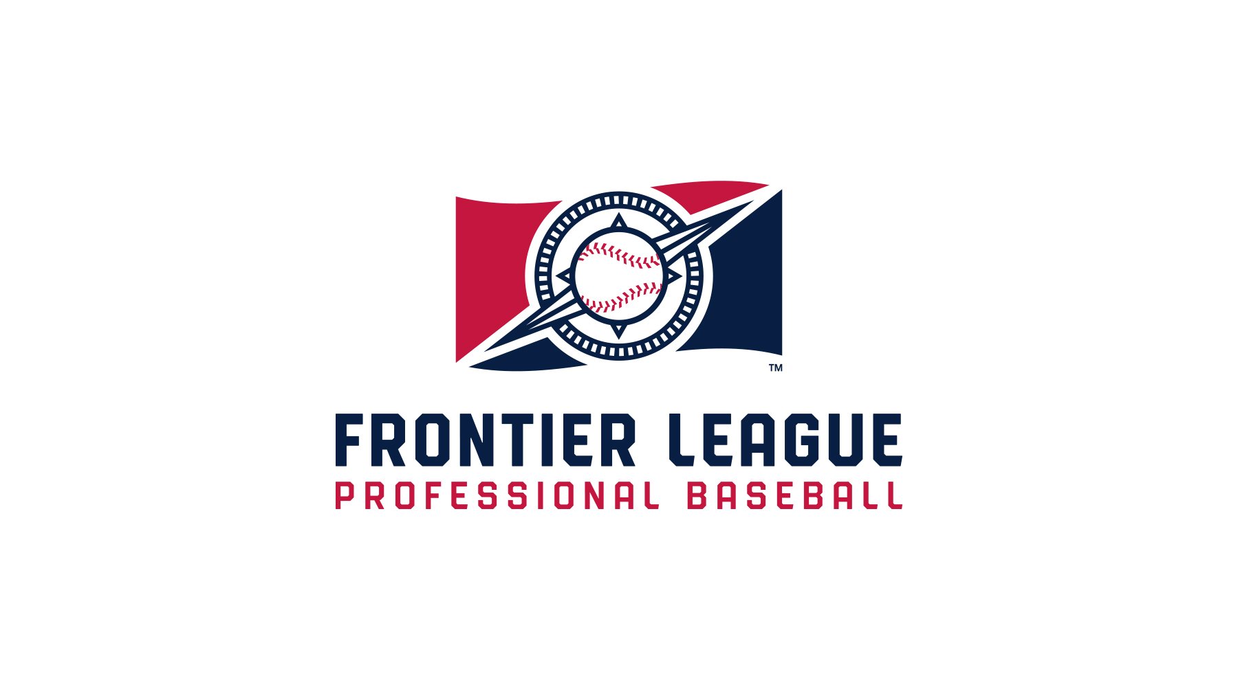
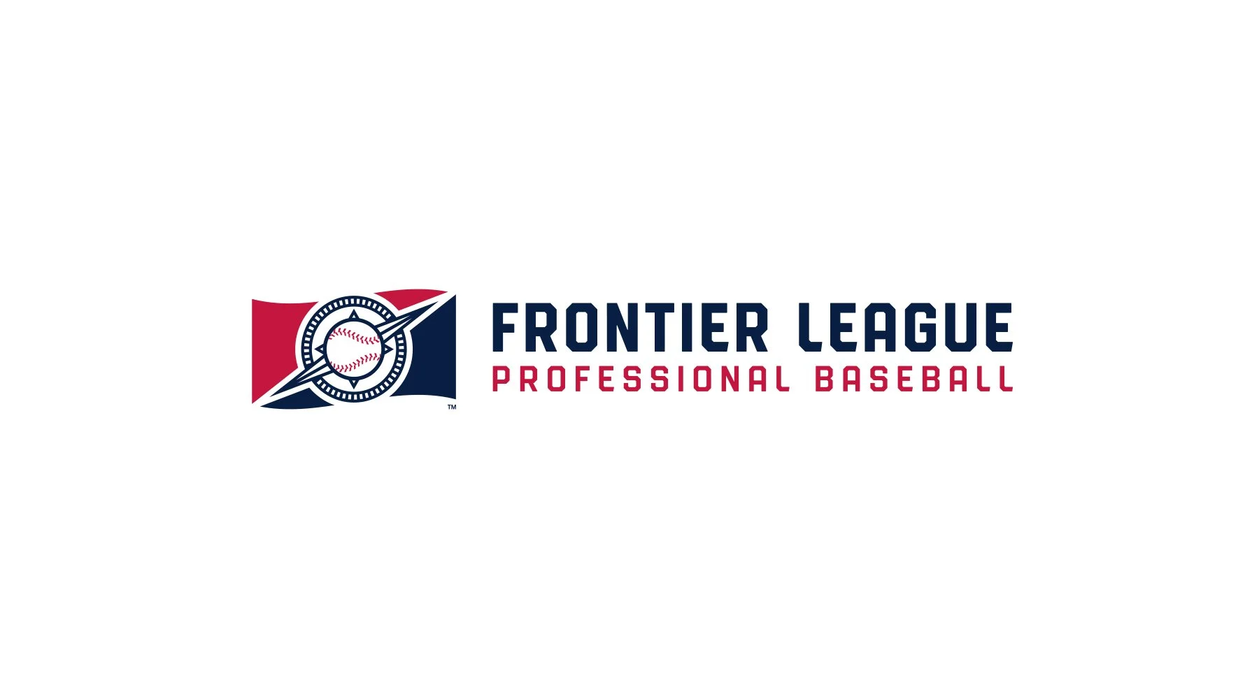
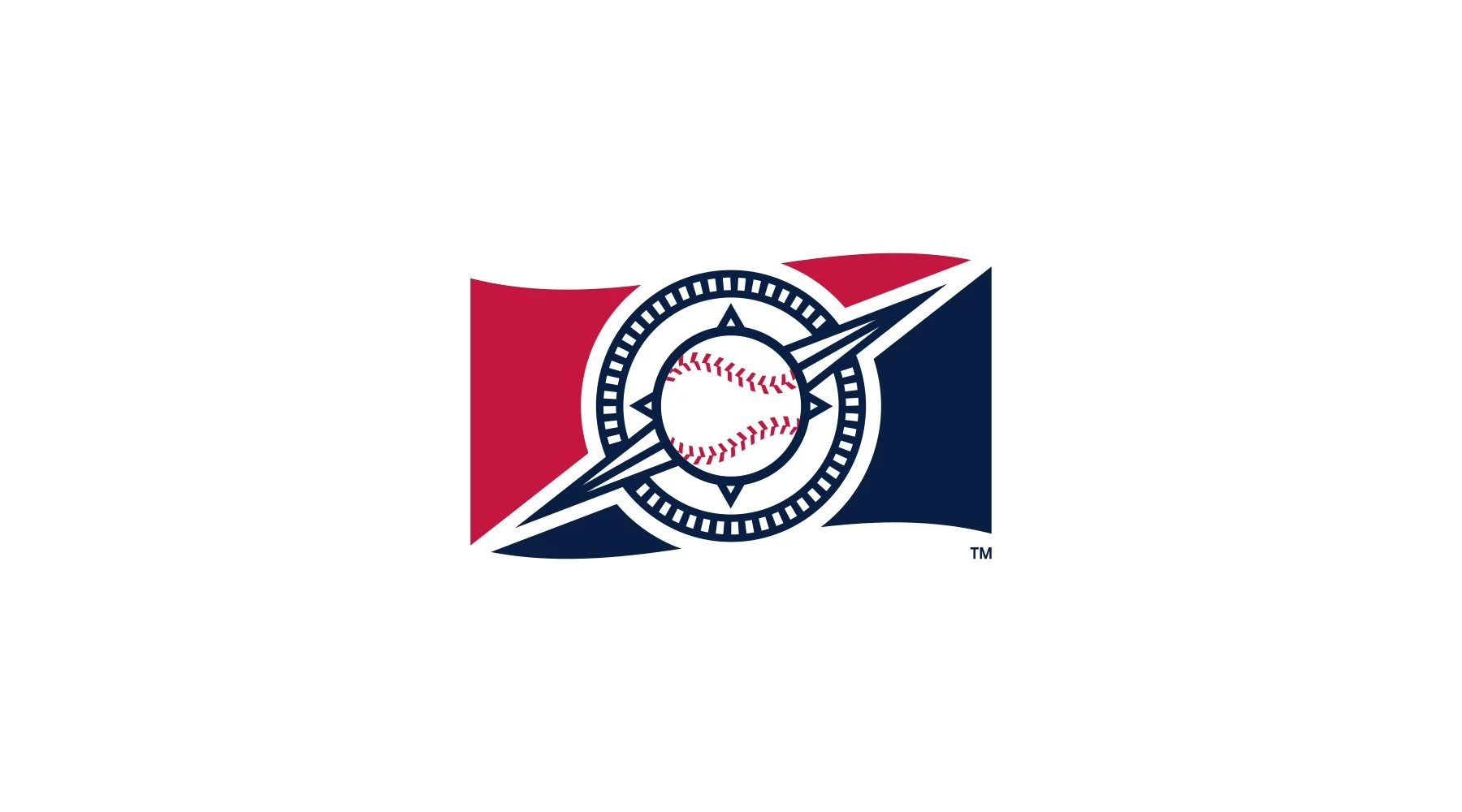
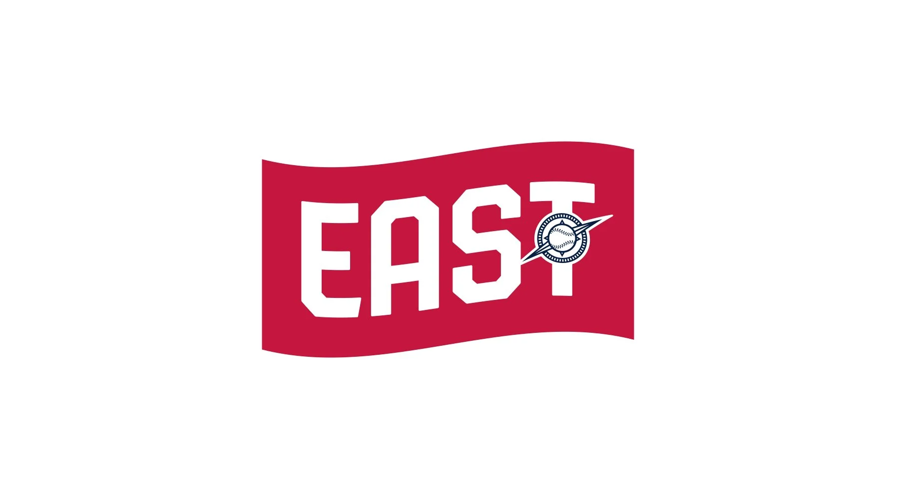
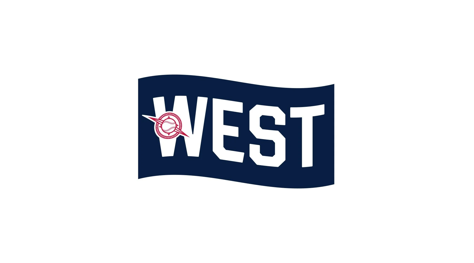
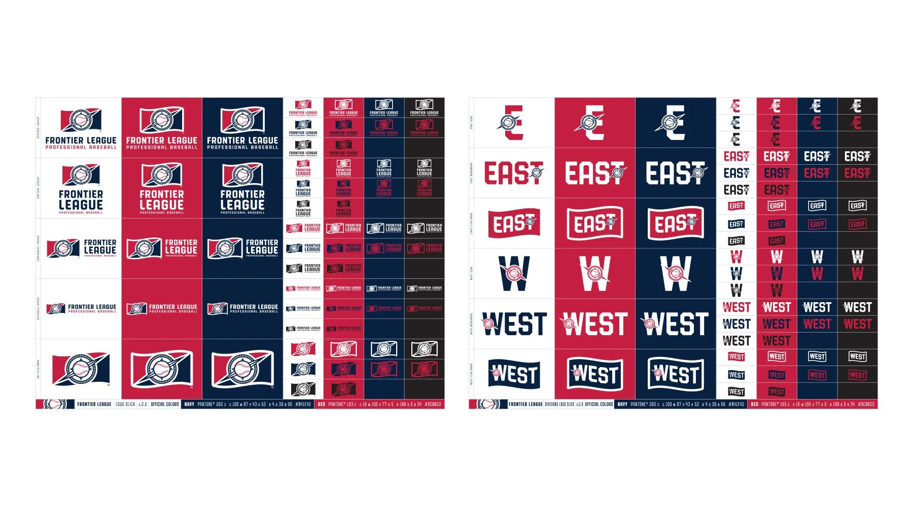
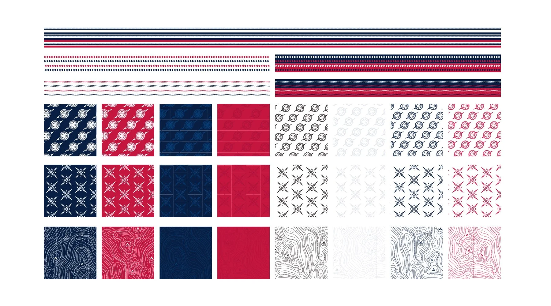
After working through different conceptual directions, the league settled on the theme of exploration and adventure, to represent the journey of the players from independent baseball all the way through to the Majors. We explored flags and other ephemera, finally landing on the compass design as seen in the final logo. The compass is pointing north east, representing the navigation of new, unchartered territories, while the upward direction is indicative of the League’s always forward-looking approach.
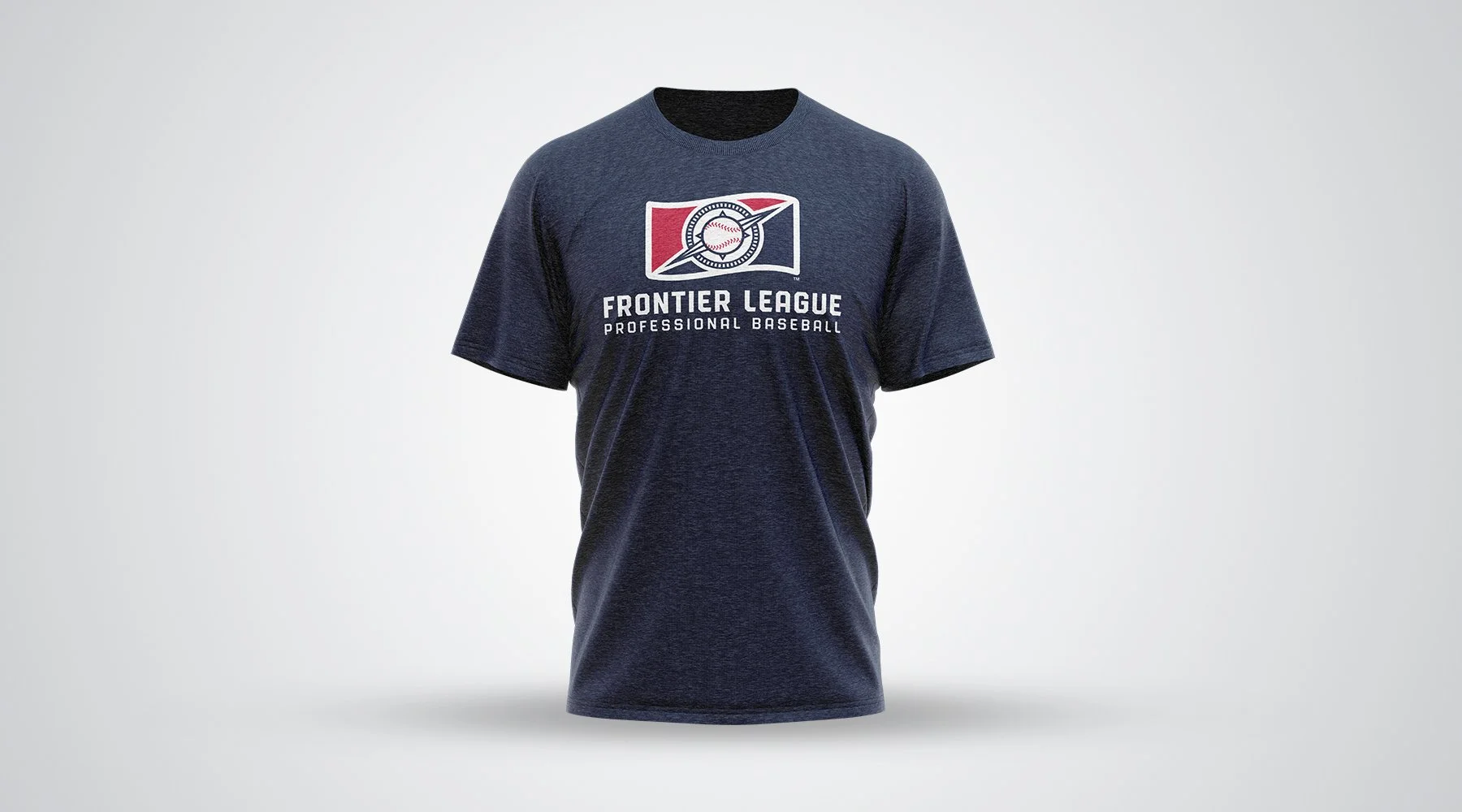
To see the brand in action, visit frontierleague.com