
Portland Winterhawks Rebrand
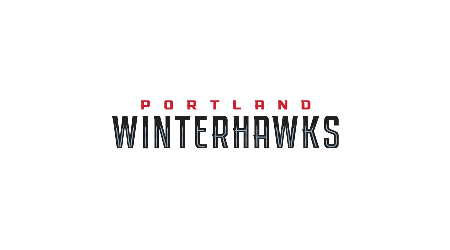
PORTLAND’S GOT A BRAND NEW BIRD
Scroll ↓
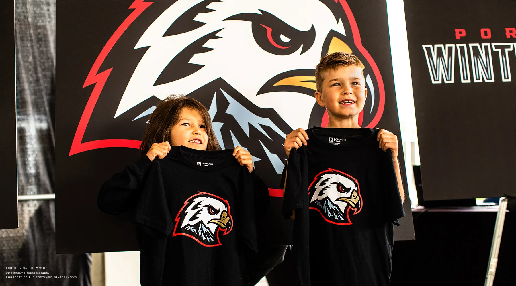
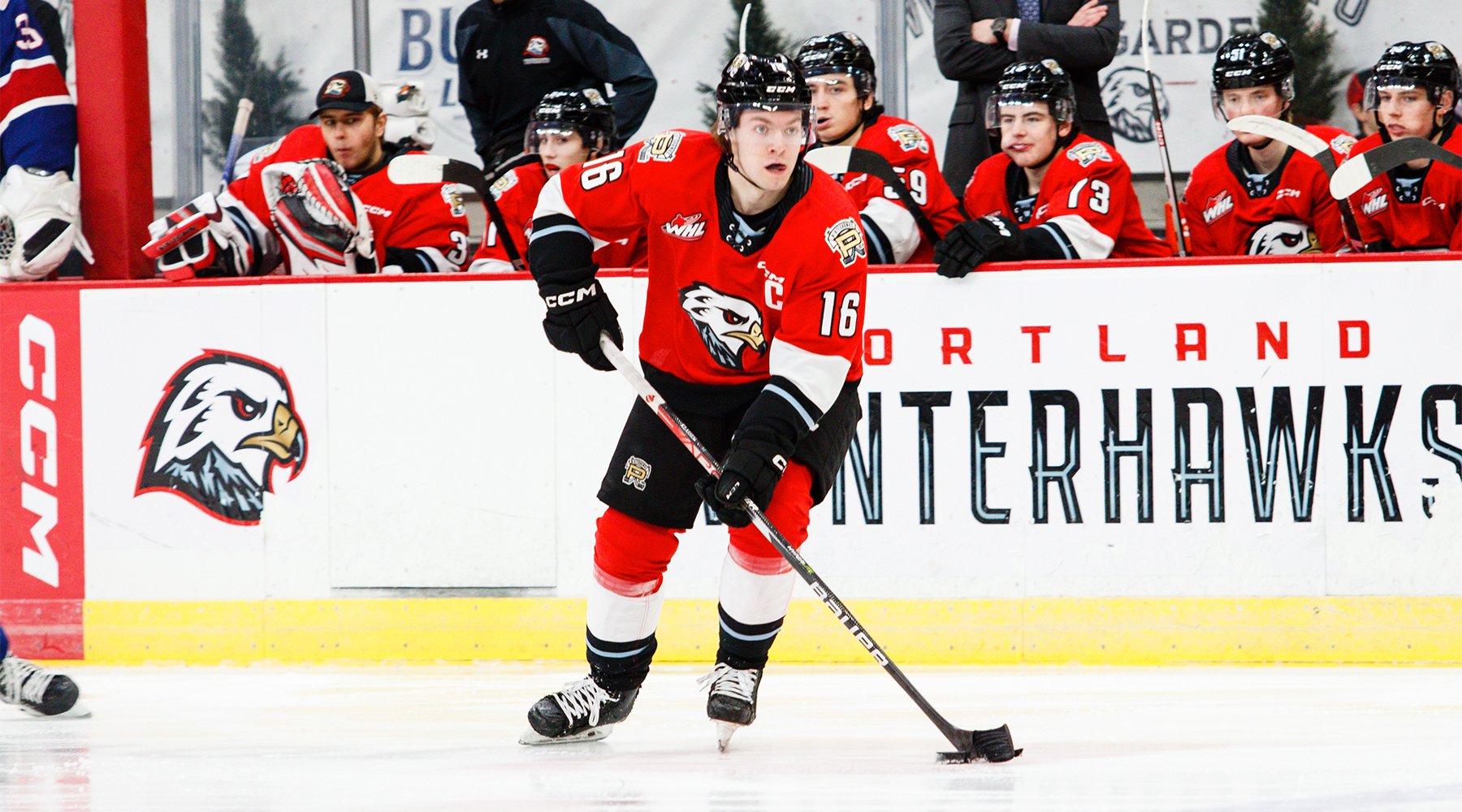
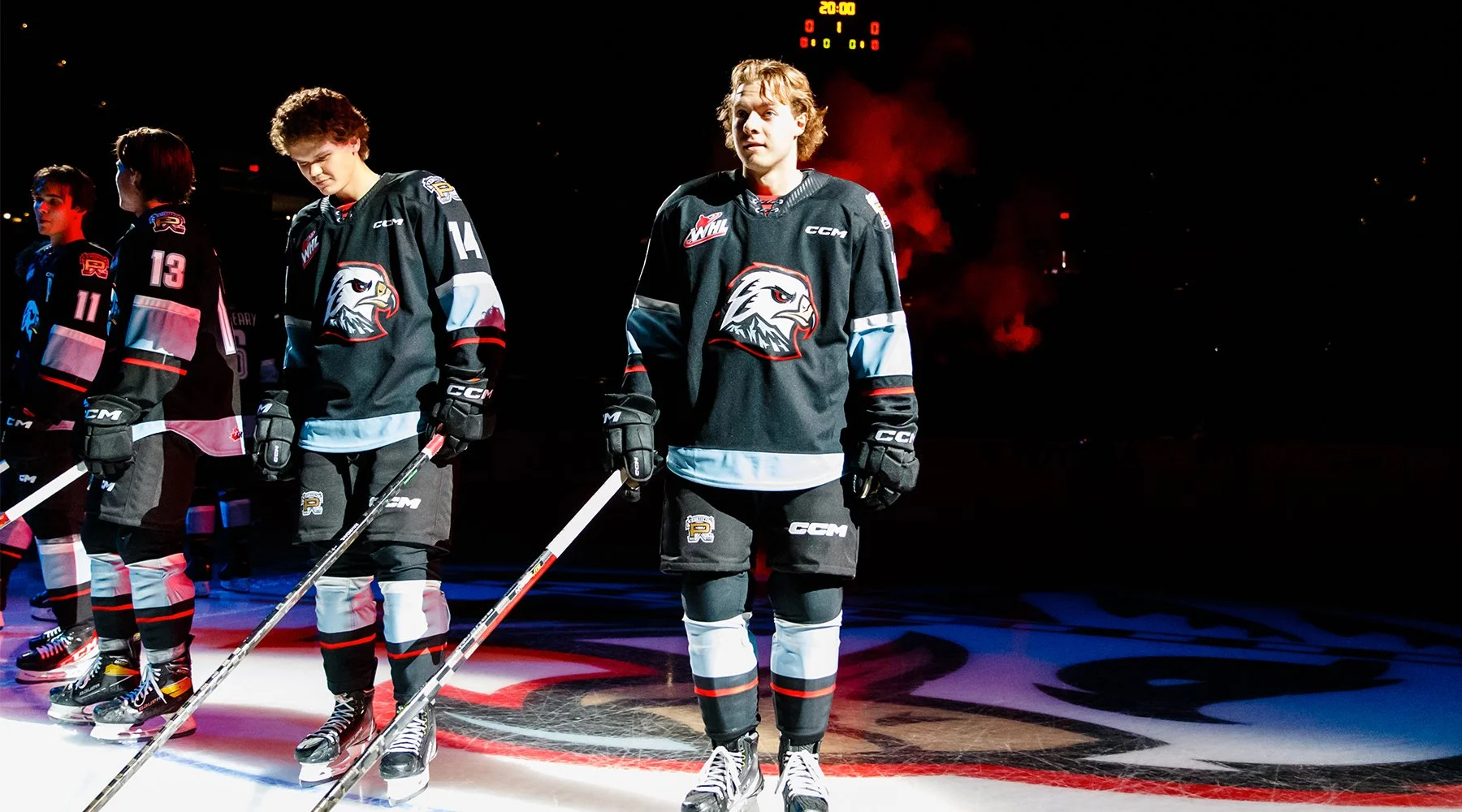
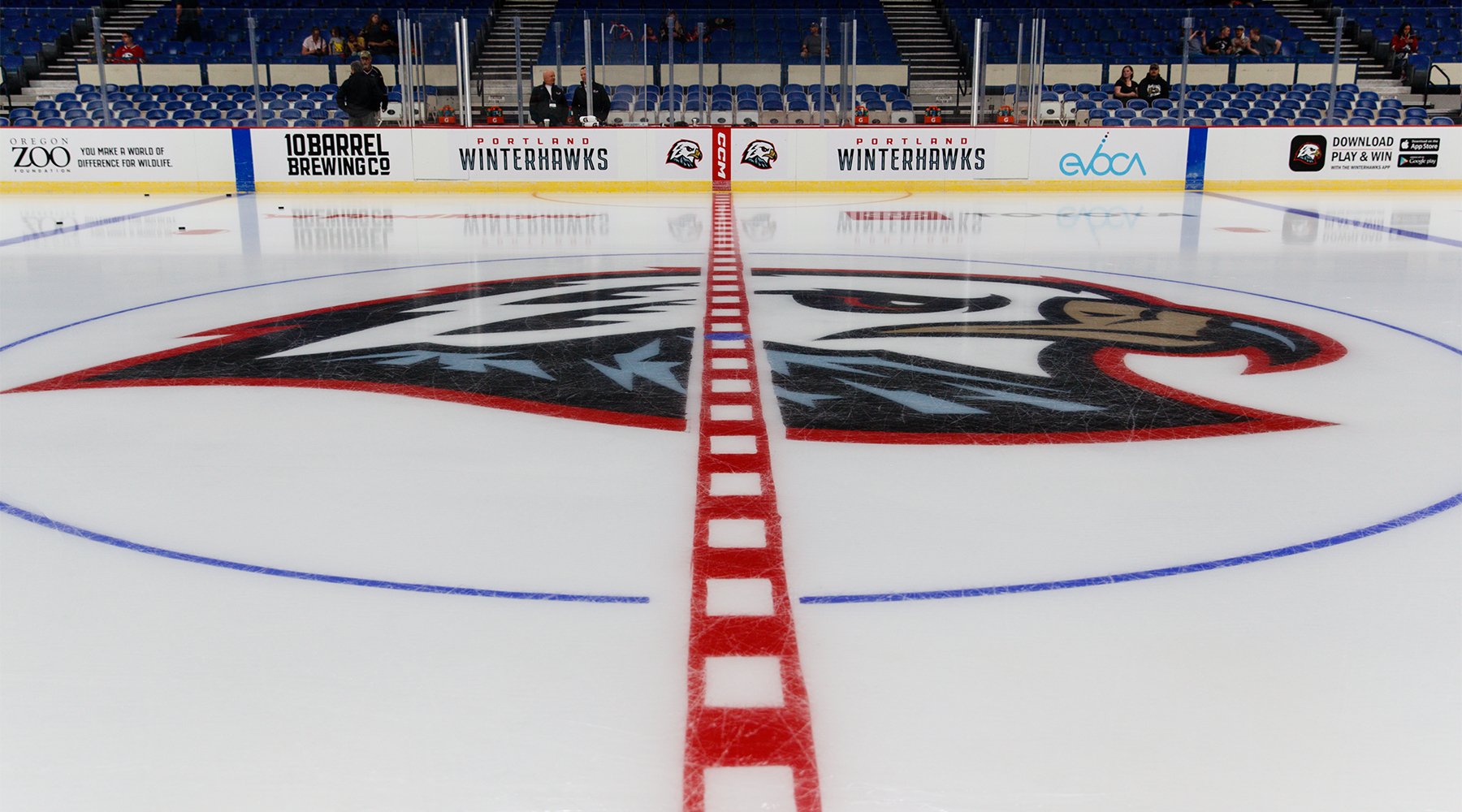
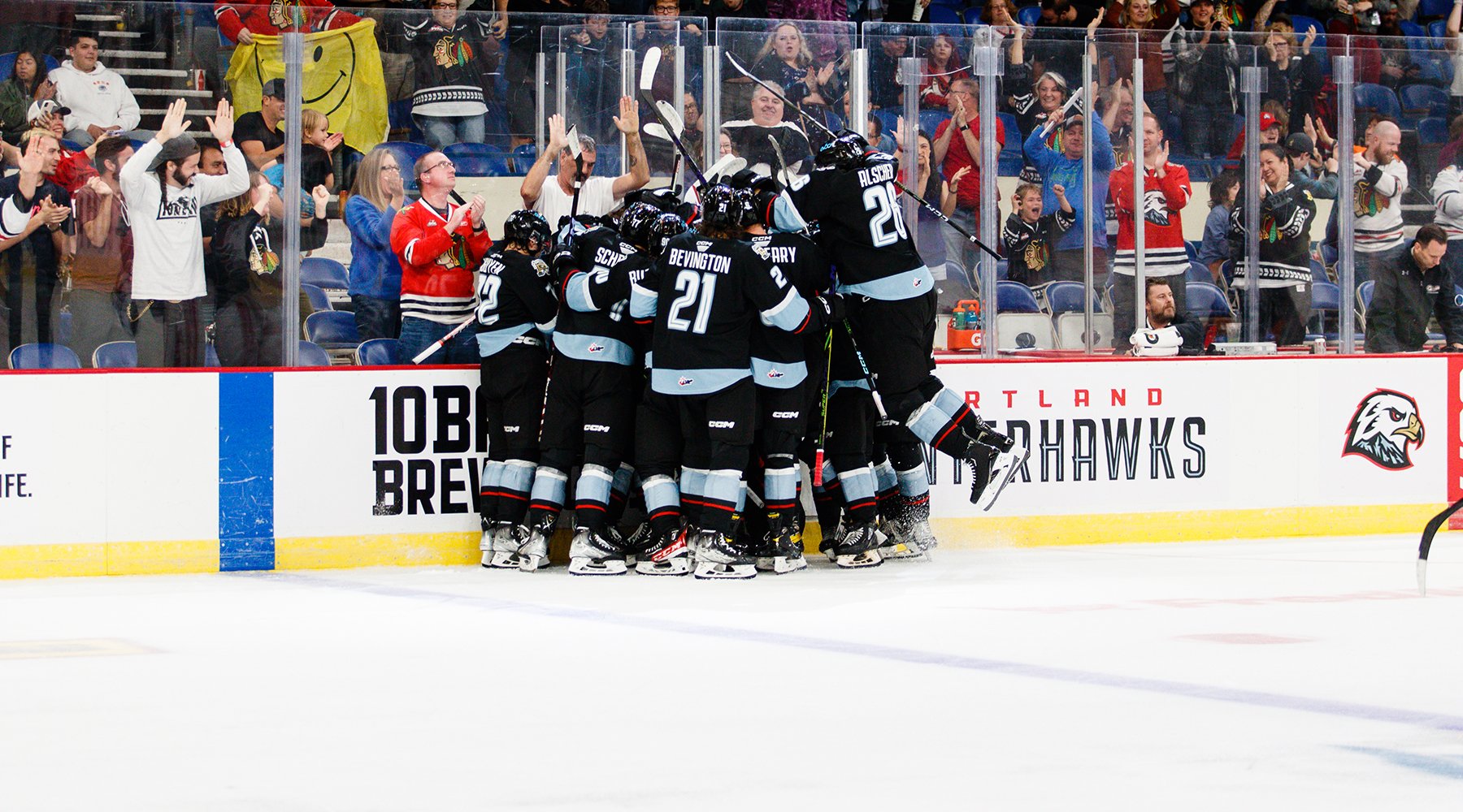
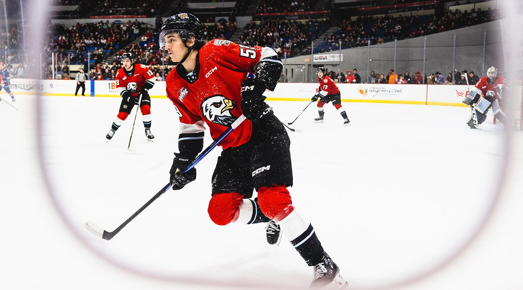
AN IDENTITY TO CALL THEIR OWN
In April of 2021, Portland Gear, an apparel company based in and focusing on Portland Oregon, reached out to have me help them rebrand the Portland Winterhawks as part of their wider arrangement to revamp the team’s merchandising and social strategies.
When the team was founded in 1976, the Winterhawks reached out to the Chicago Blackhawks for assistance in acquiring new jerseys. The NHL team generously provided uniforms and the use of their logo. When new owners Michael Kramer and Kerry Preete took over the team earlier this year, they felt it was time the team had an identity all to themselves.
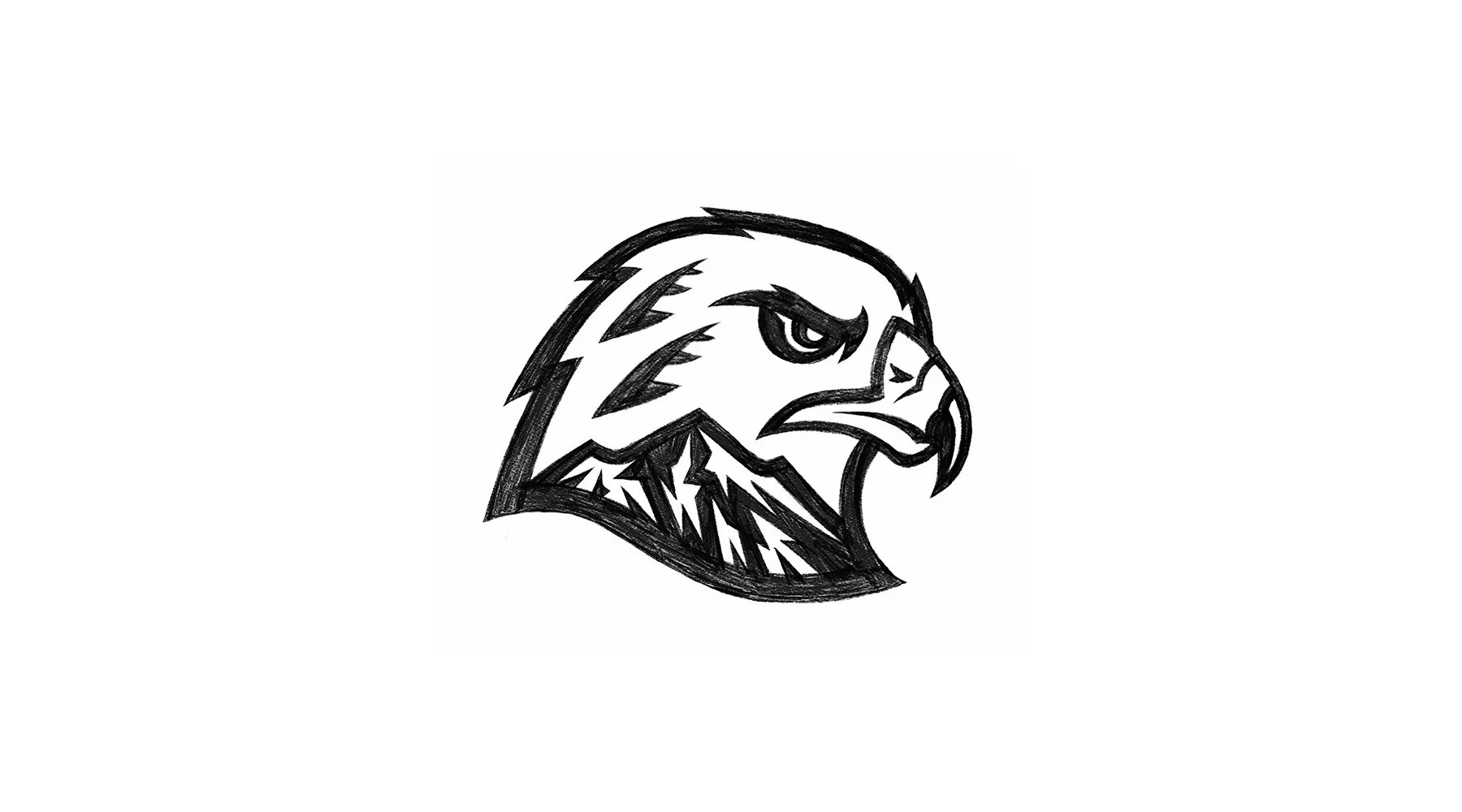
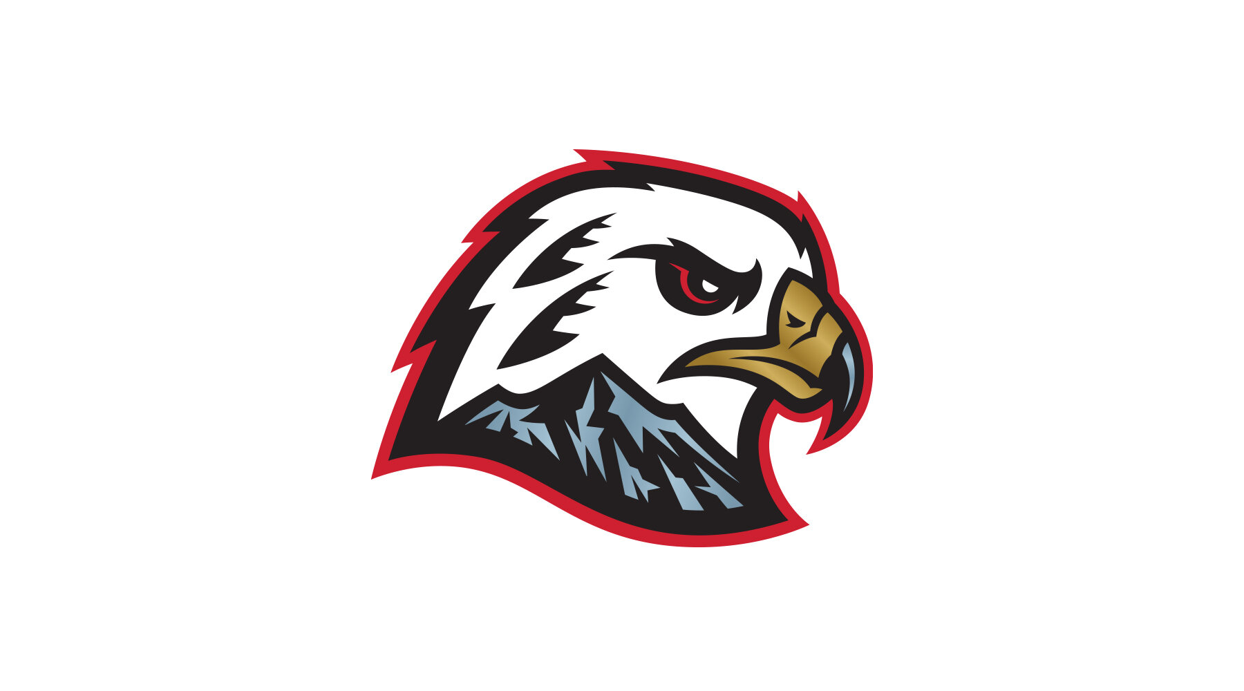
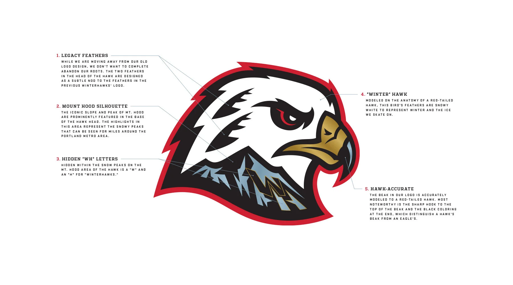
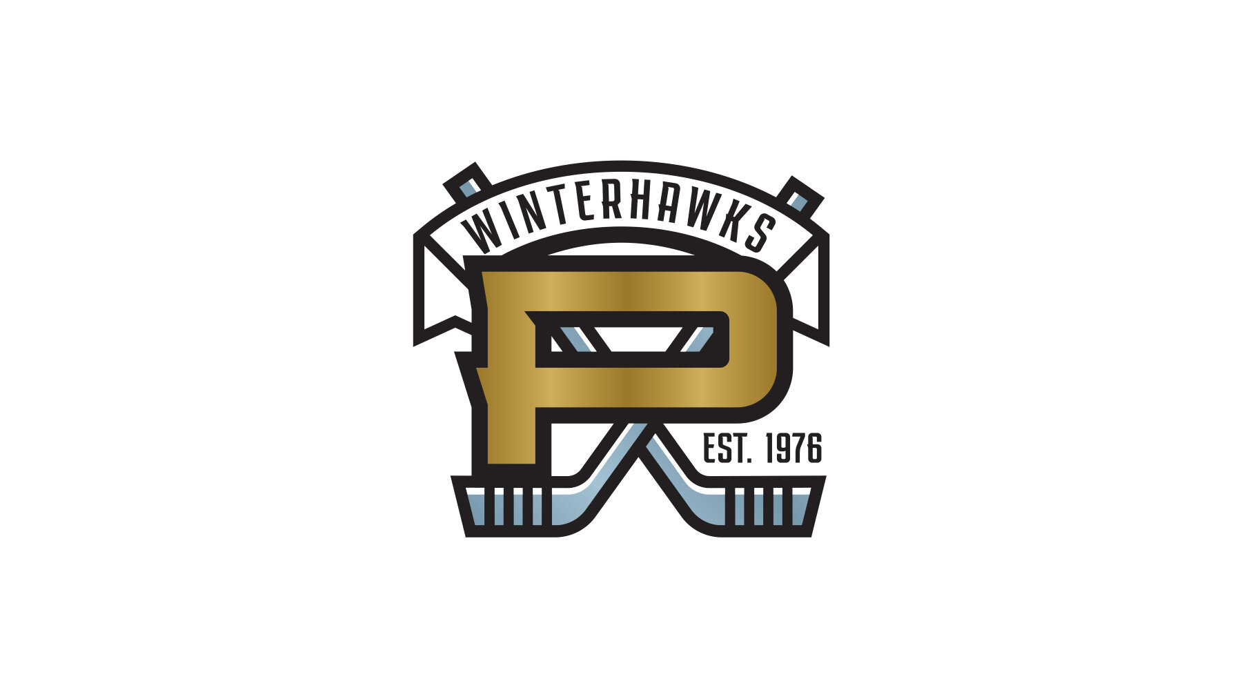
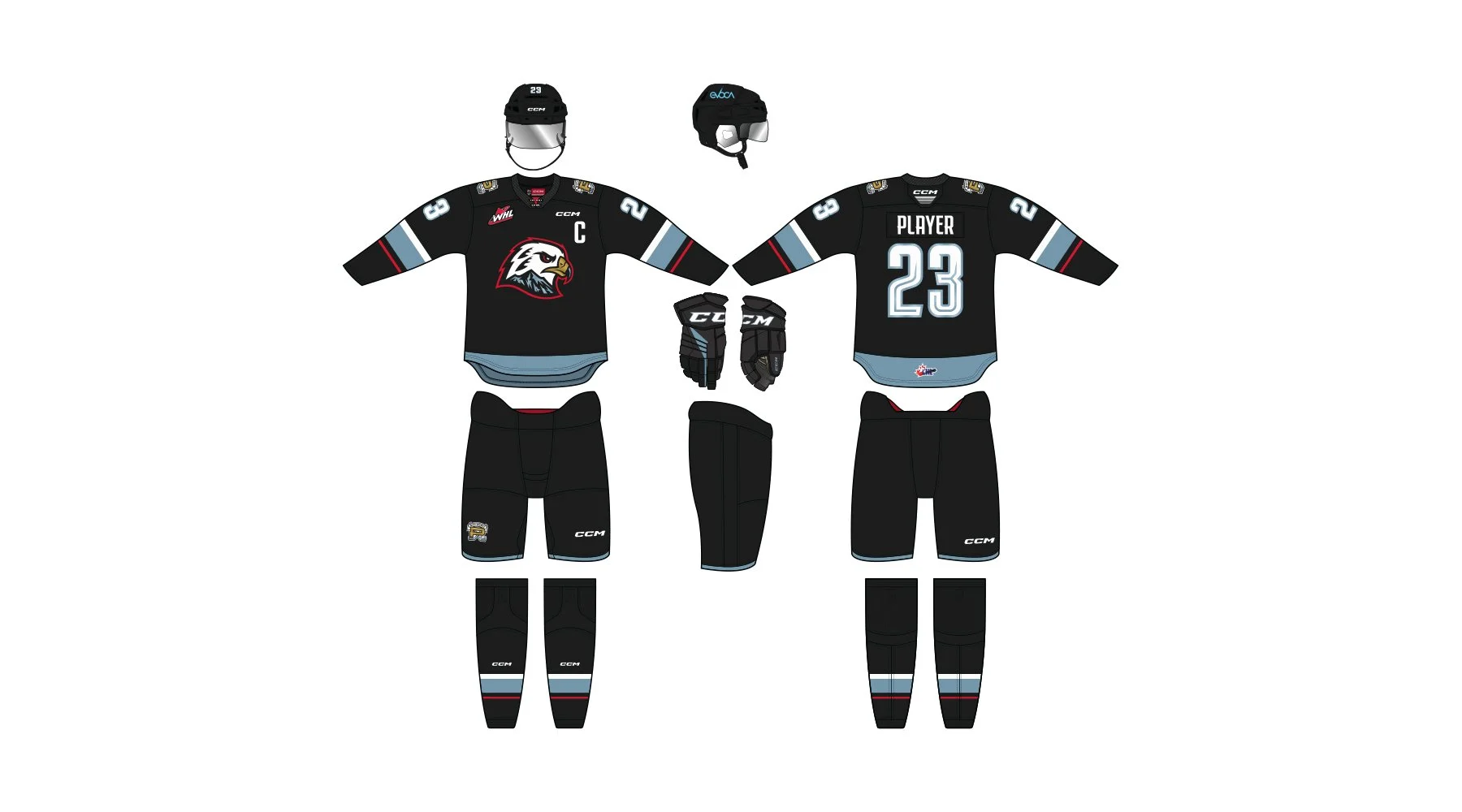
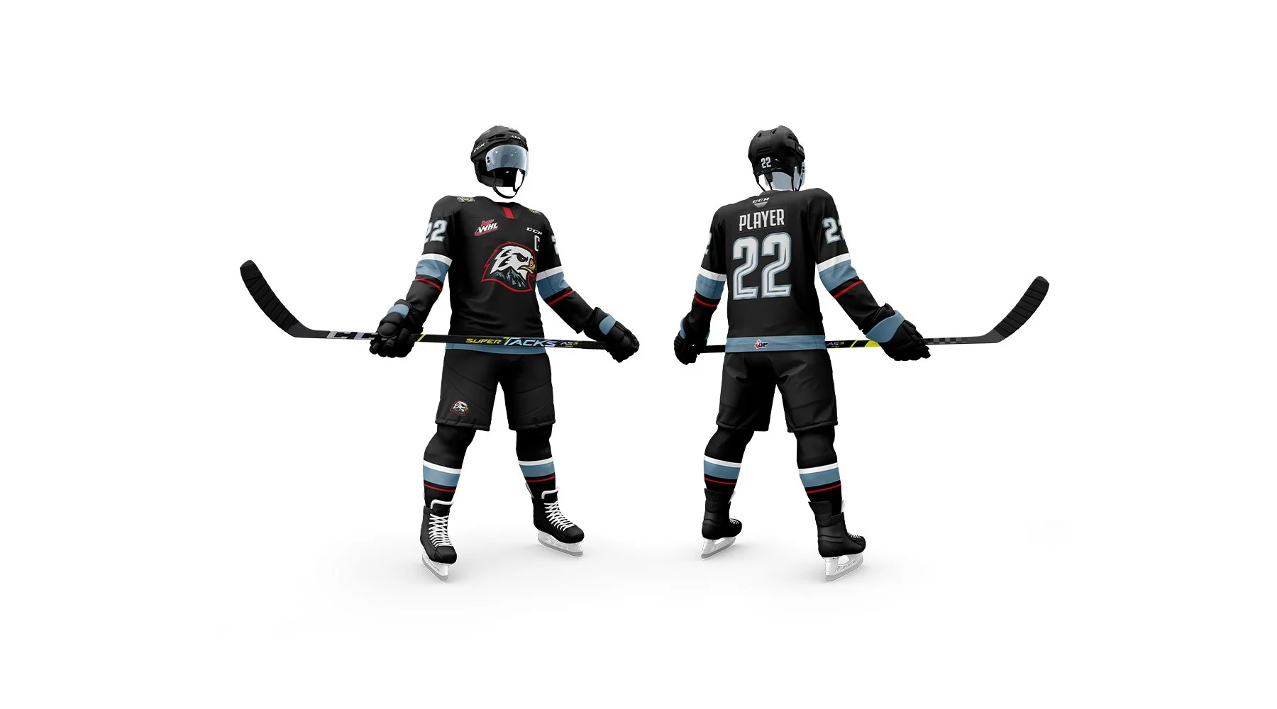
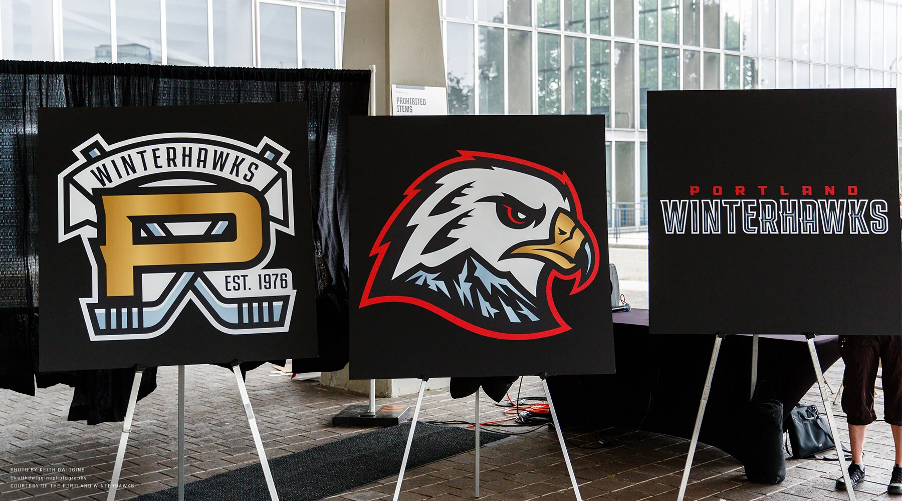
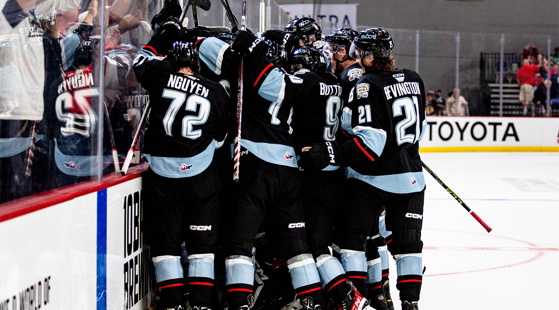
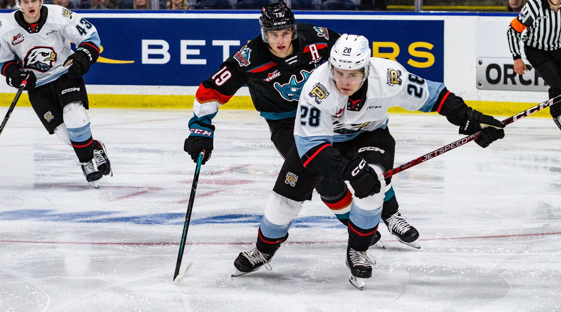
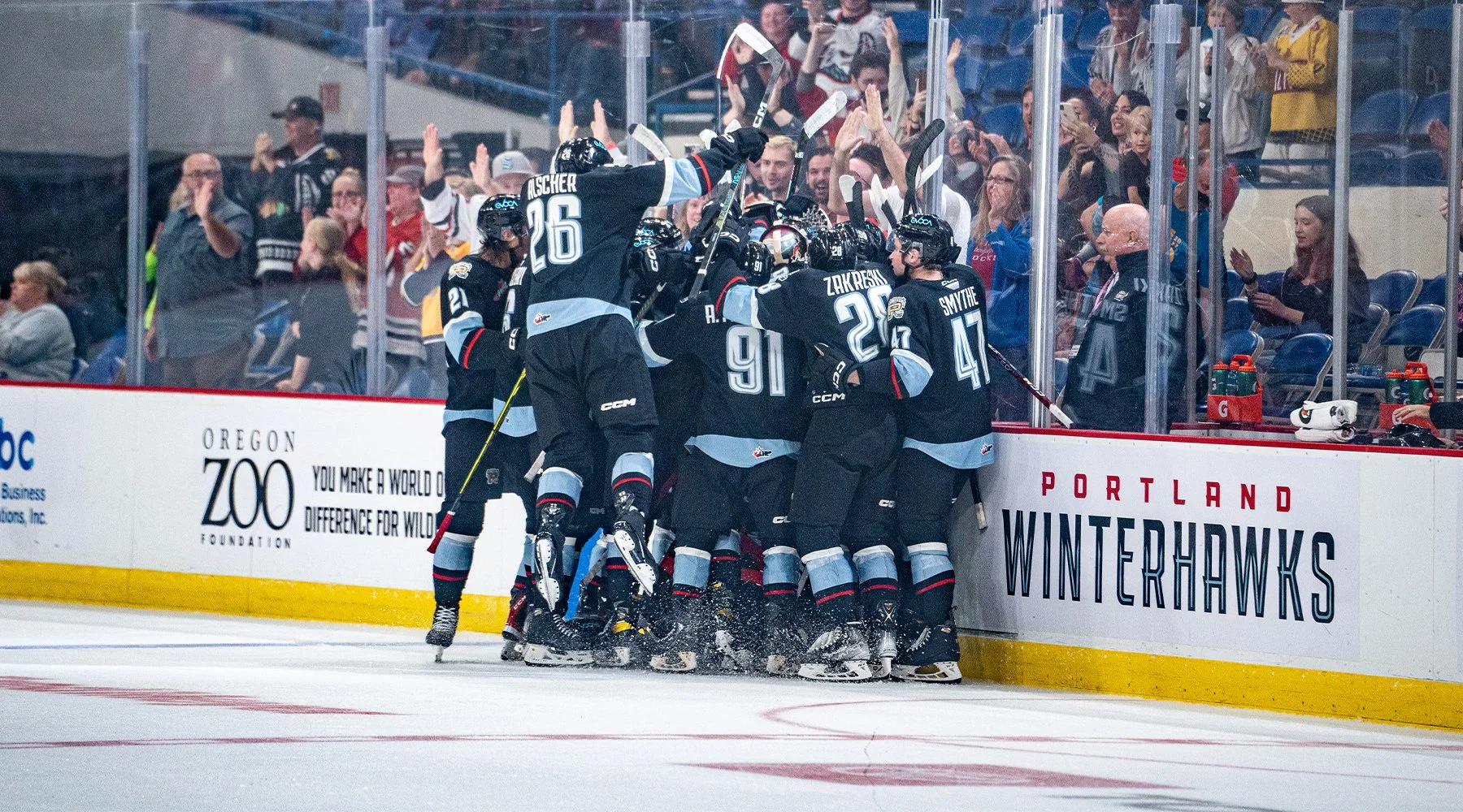
The team asked me to create a logo that was a tough “winter” hawk, while incorporating a signature feature of Portland’s skyline, Mt. Hood. Along with an updated secondary logo and all-new customized typography, this new identity is built completely from the ground up. Along with the new logos, the team asked for suggestions on new colors, and we settled on “Celly Gold” and “Squall Gray” to celebrate the team’s numerous championships and pedigree for developing NHL players, as well as to reference the rainy, gray skies of Portland and the rocky (and wintry) terrain of Mt. Hood.
The new brand hit the ice for the first time in the 2021/22 season. For more information, visit winterhawks.com/article/winterhawks-reveal-new-brand-identity