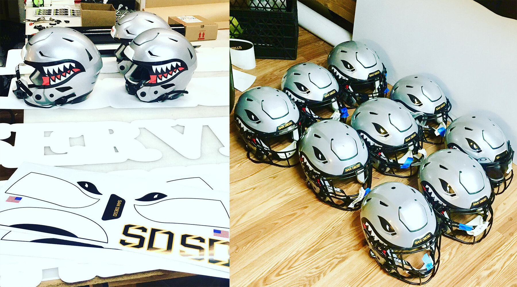
San Diego Strike Force Rebrand
BOMBS AWAY
Scroll ↓
A LOVE LETTER TO NAVAL AVIATION
In the spring of 2019, the San Diego Strike Force approached me to do a complete overhaul of the team’s brand from top-to-bottom. The original team logo featured a Russian MiG fighter jet, but was adjusted to be a 3D rendering of an F-14 Tomcat. In both cases, these were inappropriate choices for the team wanting to celebrate the military community of San Diego; the first being that it’s a foreign jet, the second due to being retired by the U.S. Navy and no longer being in service.
In establishing a new brand direction, the Strike Force wanted to incorporate and portray an authentic representation of visual aspects of military aviation. San Diego has a rich military history, and the Strike Force wanted to honor the tradition and heritage of Naval Aviation in the US Navy and Marine Corps.
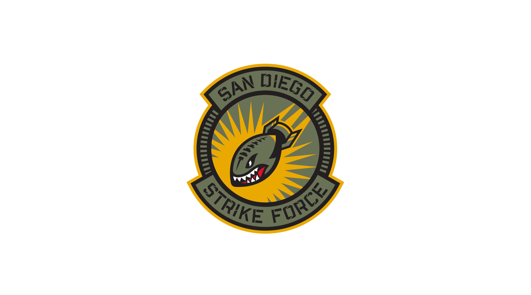
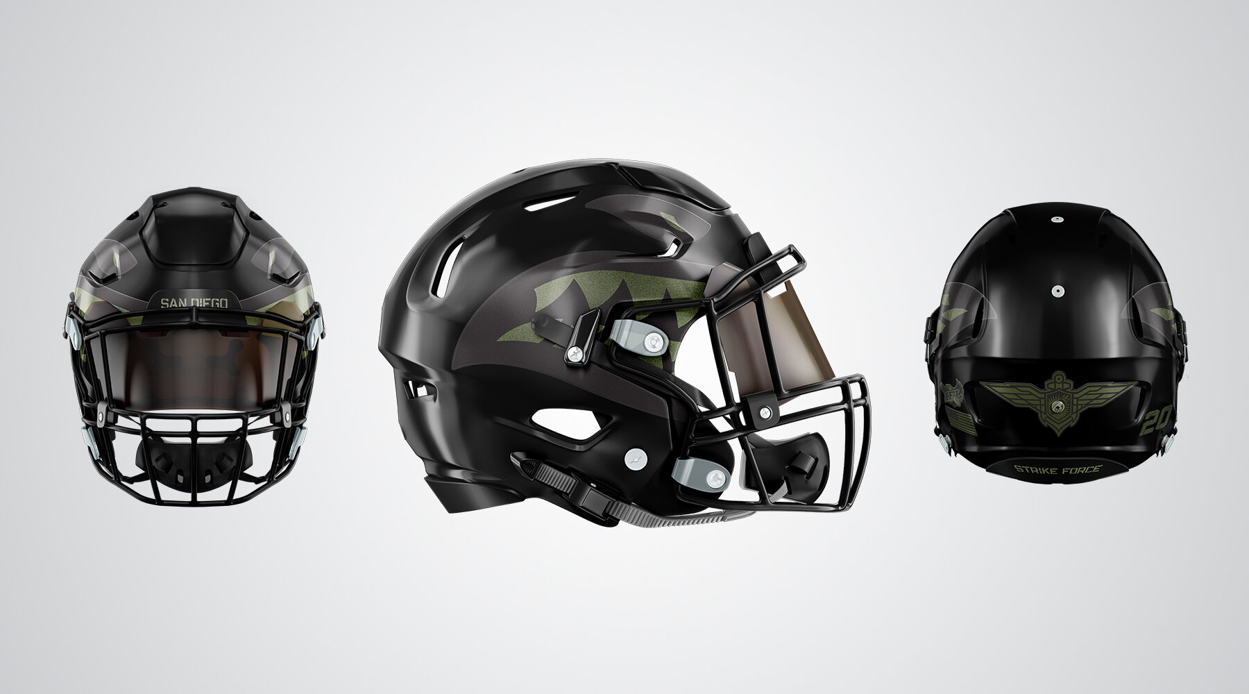
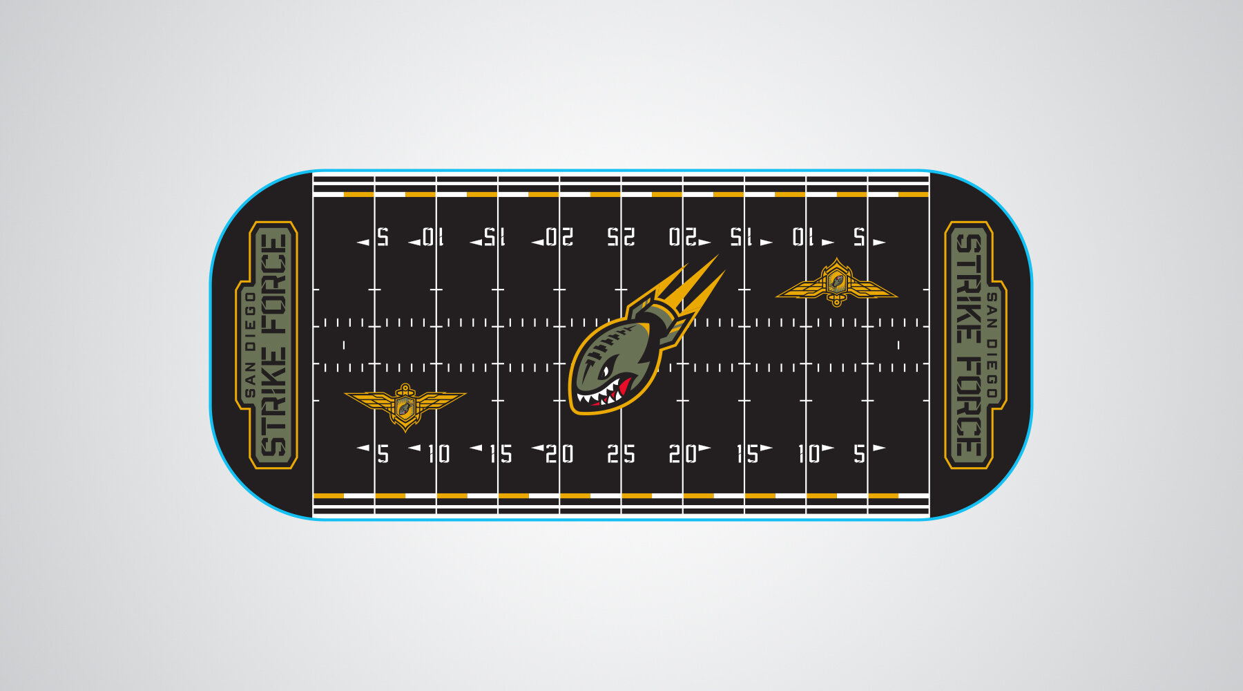
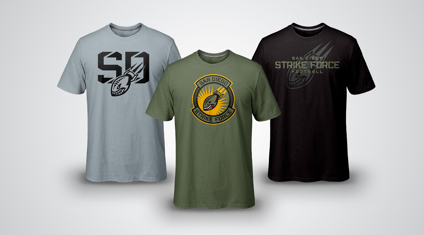
The brand was ultimately developed by wanting to have the players on the field represent the look of the military’s elite corps of fighter pilots, and pulled inspiration and imagery from their flight suits, squadron patches, pilot’s wings pin, and other key visual cues.
The primary team colors are derived directly from these sources; our olive green color is the same shade used by the supplier of the military’s flight suits, while the gold is intended to reflect the look of a pilot’s wings pin from their uniforms.


