
San Diego Padres 50th Anniversary Branding
THE SWINGIN’ FRIAR IS BACK
Scroll ↓
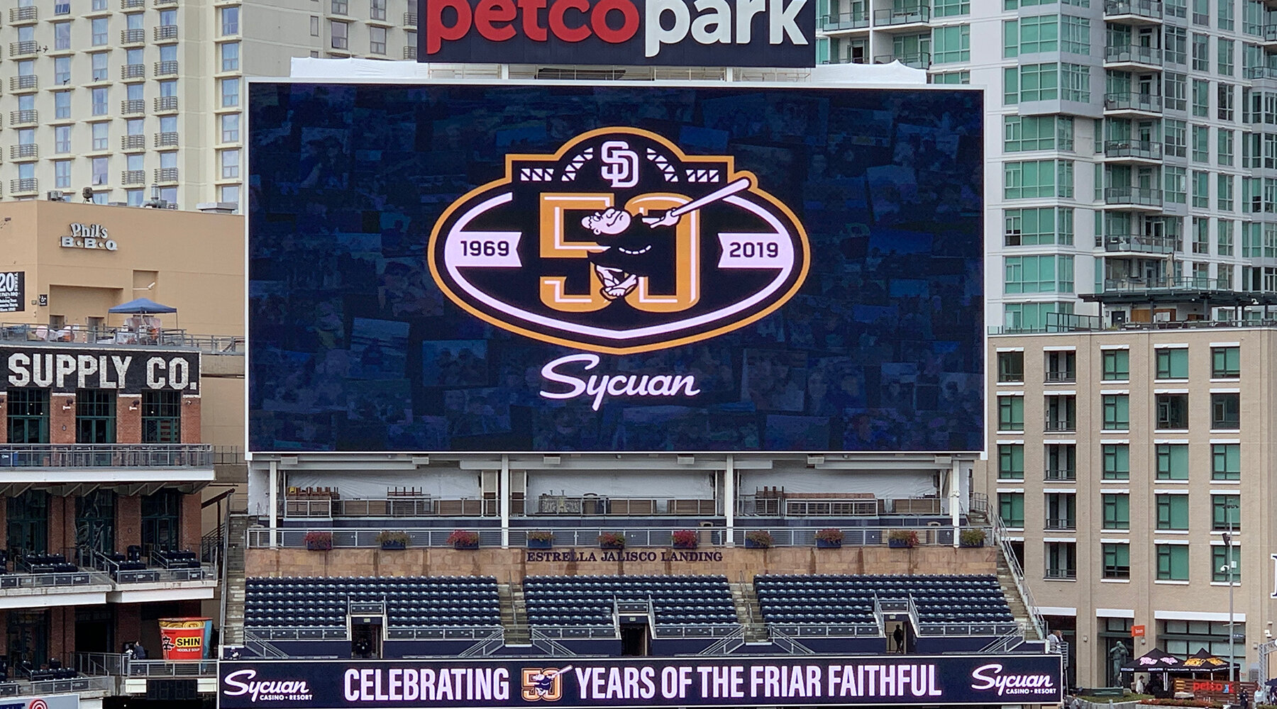
A GOLDEN YEAR
In late 2017, the Padres asked me to develop the branding for their 50th anniversary. The team wanted something that would embody the club’s history over their time in San Diego, and to reflect the community that they’re so proud to be a part of. The logo uses the famous Gaslamp Quarter sign as a foundation for the holding shape, while also incorporating some of the architectural features of the stadium. Finally, and most significantly, the Swingin’ Friar makes a return, completely redrawn and updated for the modern era.


