Coachella Valley Firebirds Brand Identity
BRINGING HOCKEY TO THE VALLEY DESERT
Scroll ↓
A STORY OF FIRE AND ICE
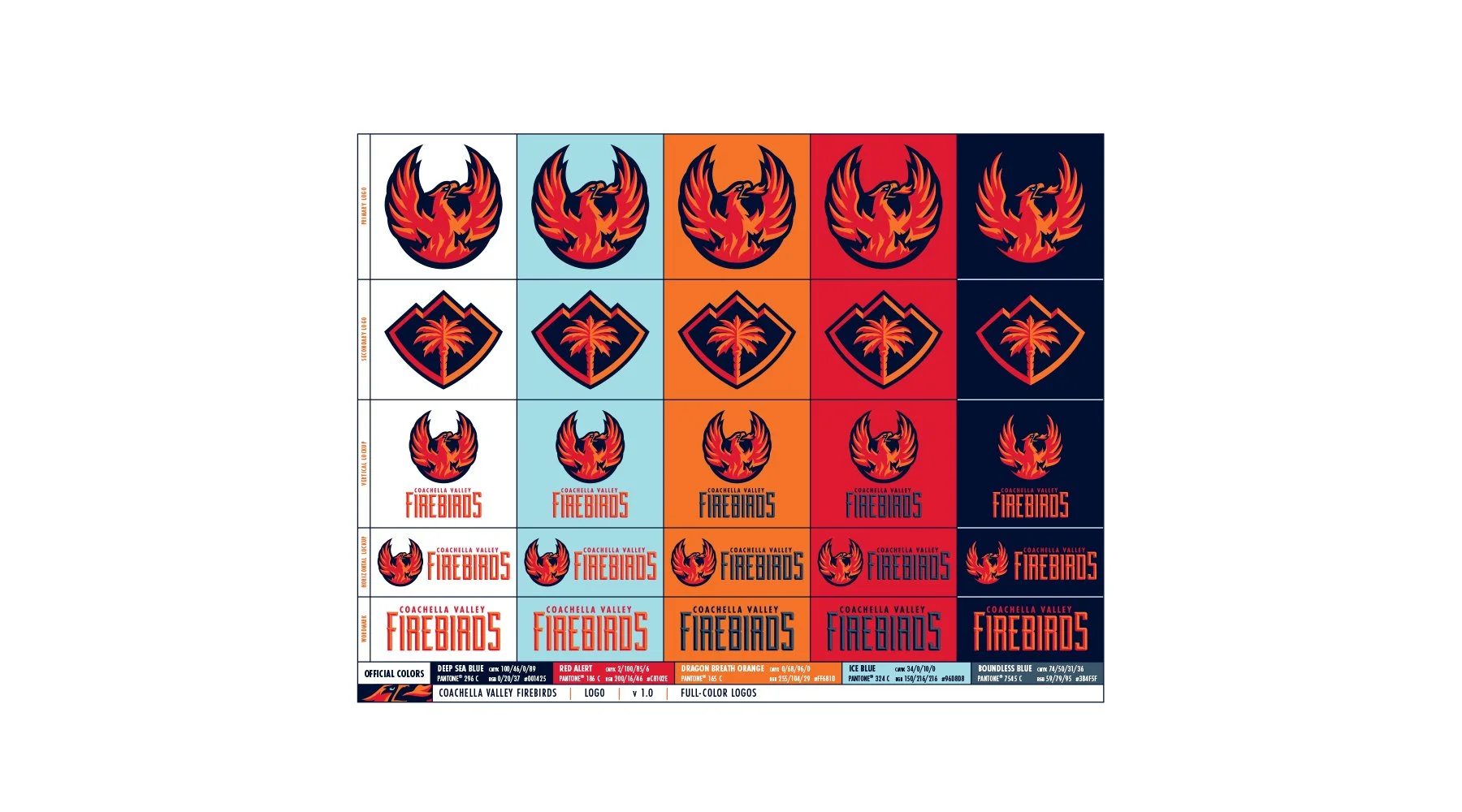
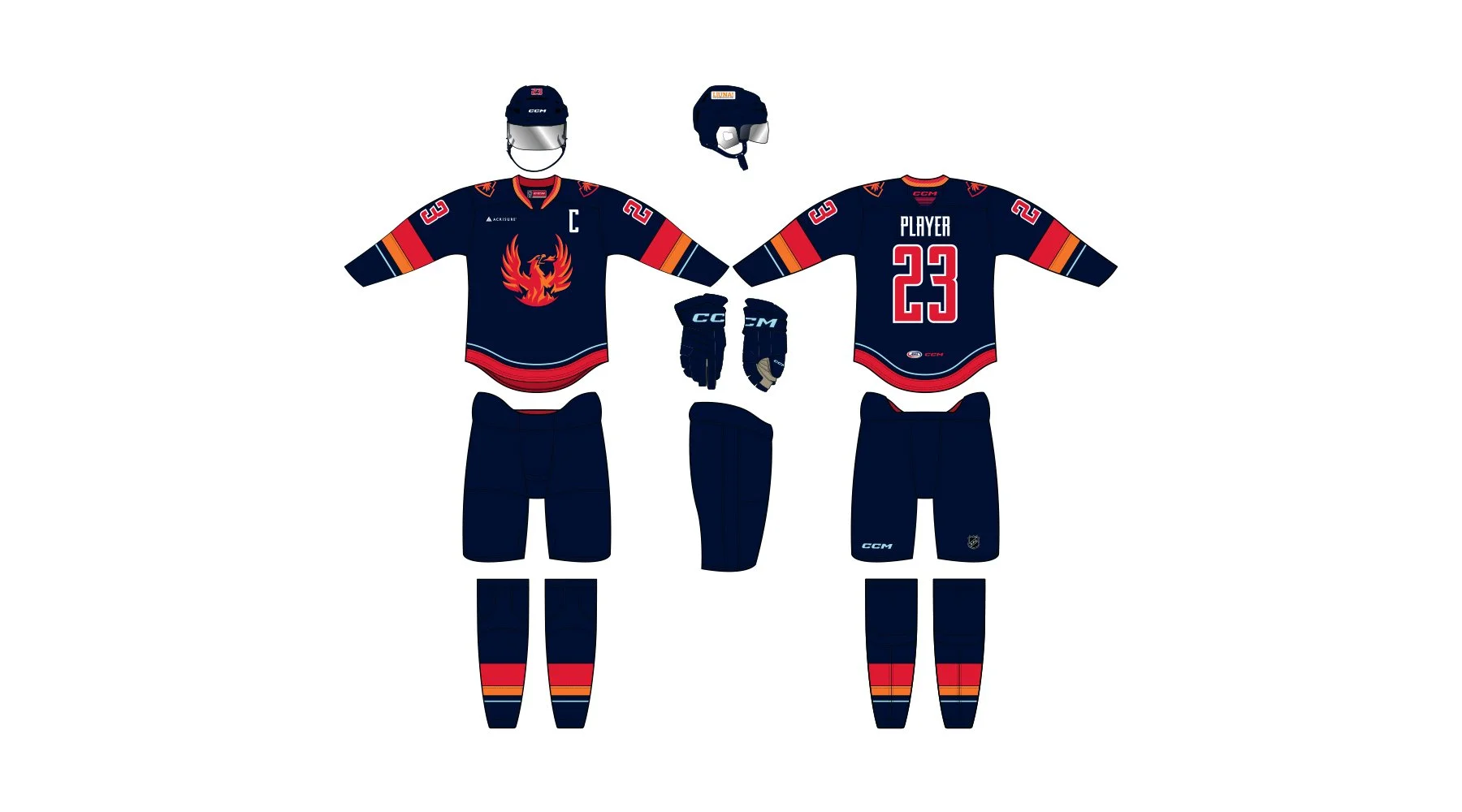
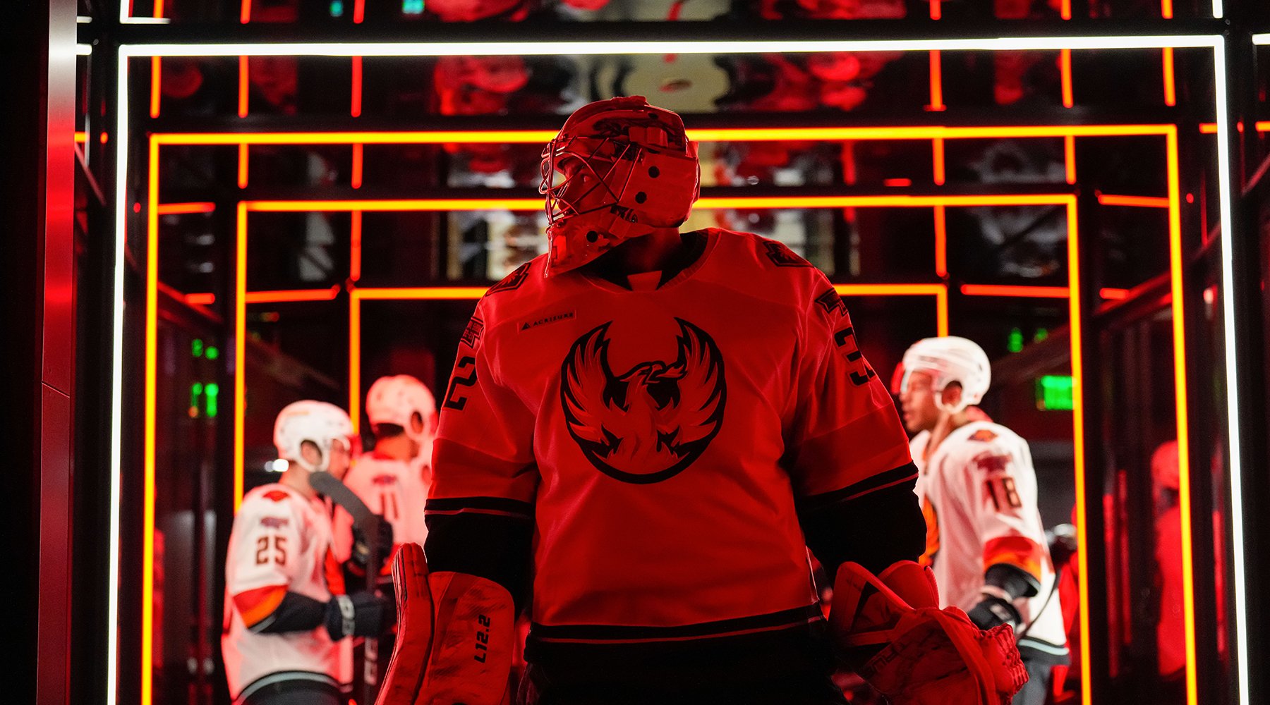
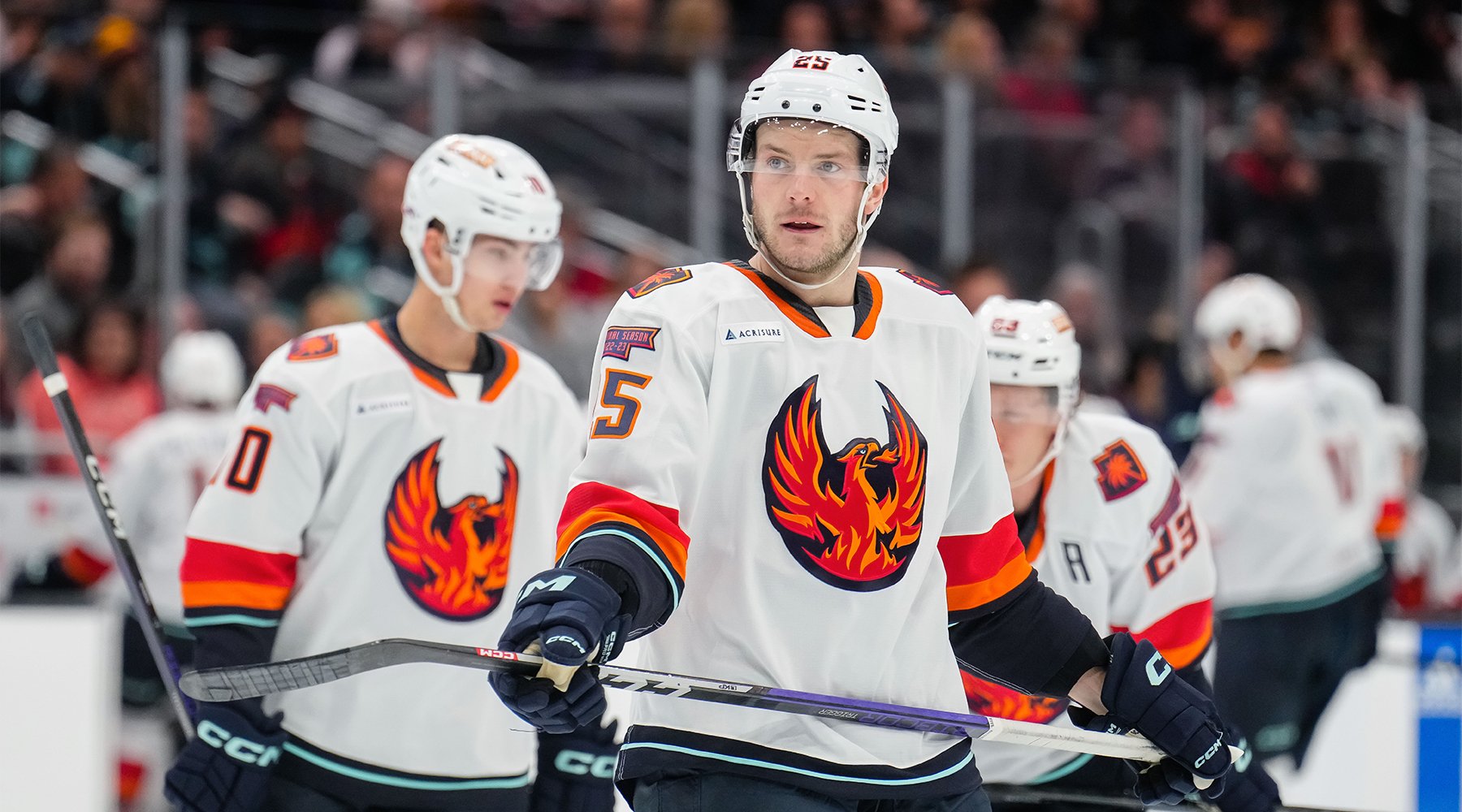
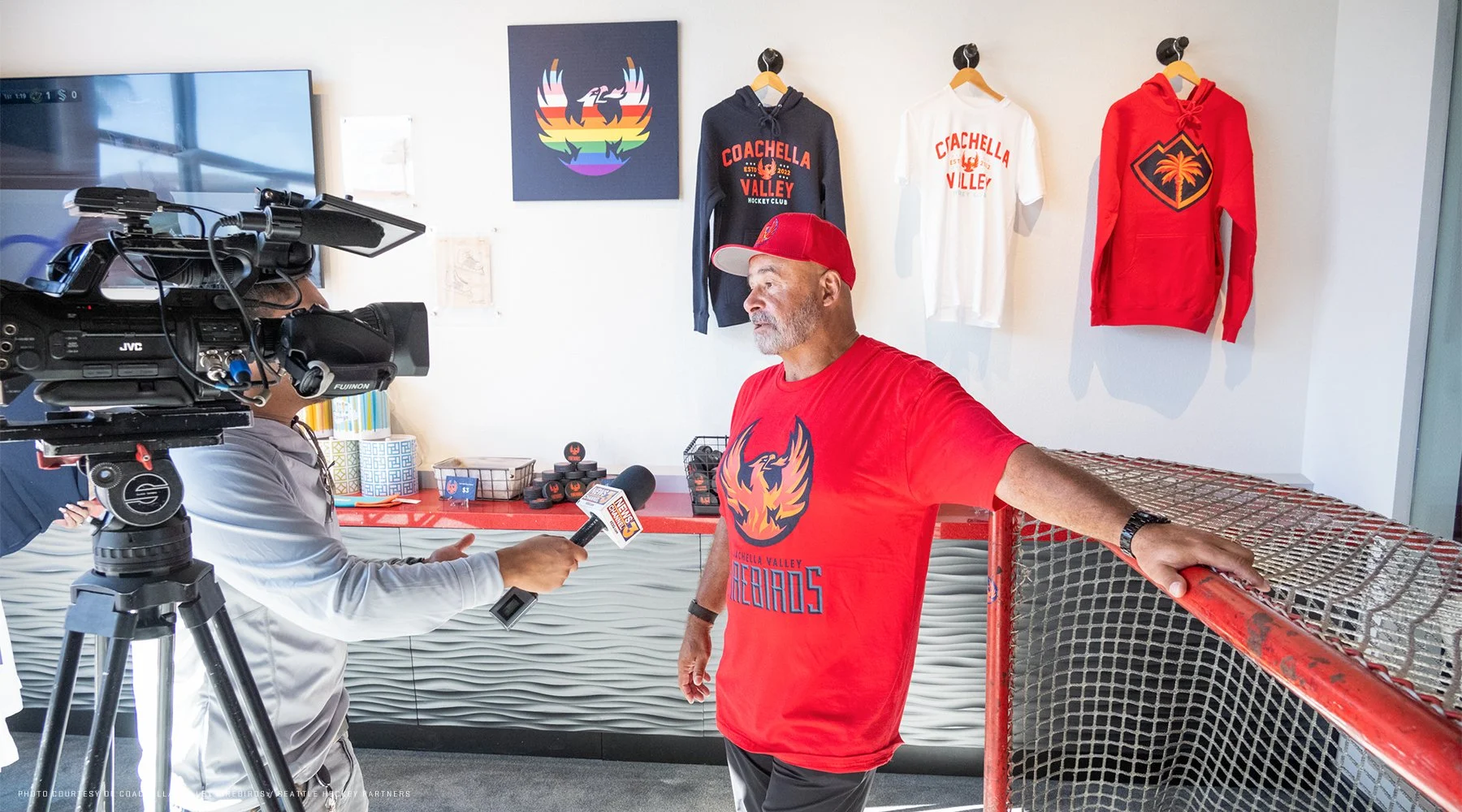
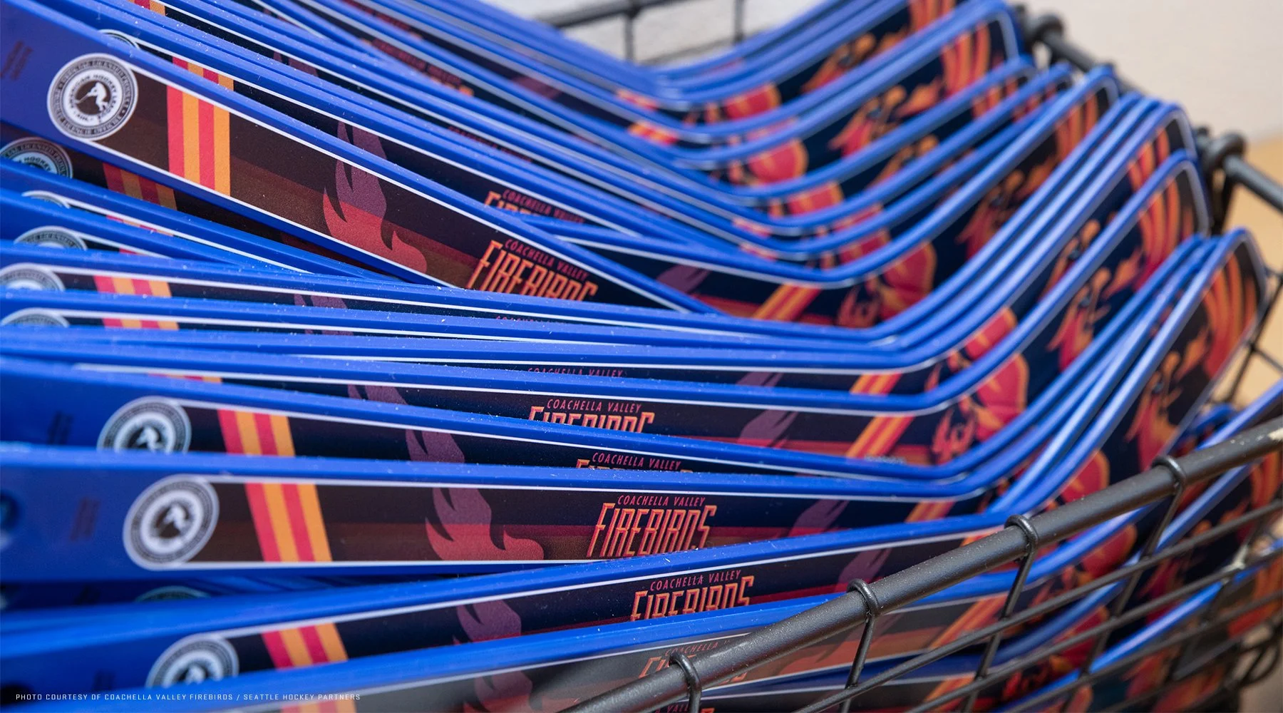
Having helped the Seattle Kraken develop their secondary logo (the Space Needle / anchor shoulder logo), the team reached out to me again to develop the brand identity for their new, top-level affiliate in the Palm Springs region of Southern California. For this brand, we developed a primary logo, secondary logo, custom typeface, uniforms (to be unveiled later this year), and a complete brand program complete with brand identity standards guidelines.
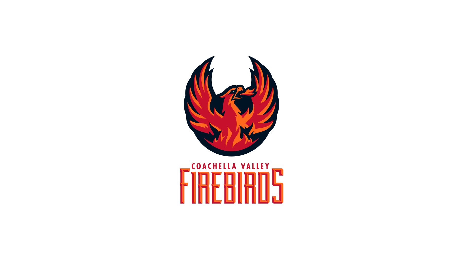
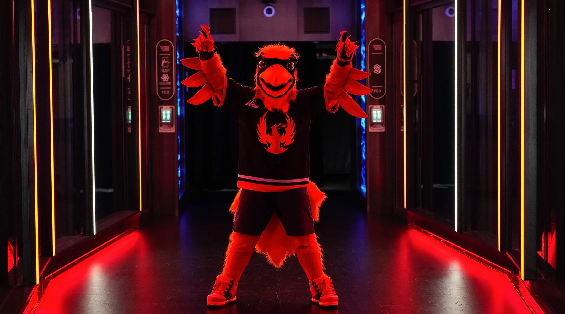
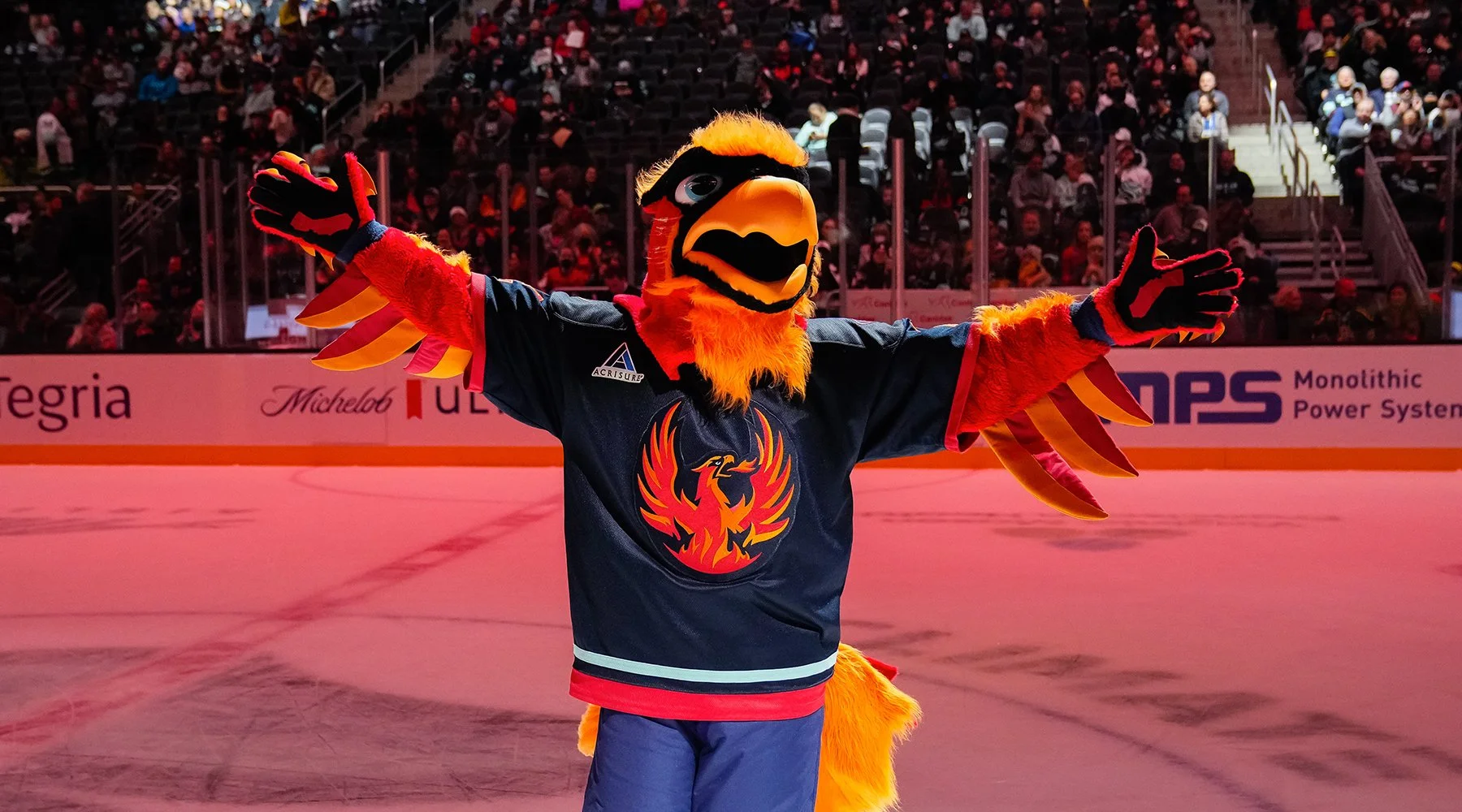
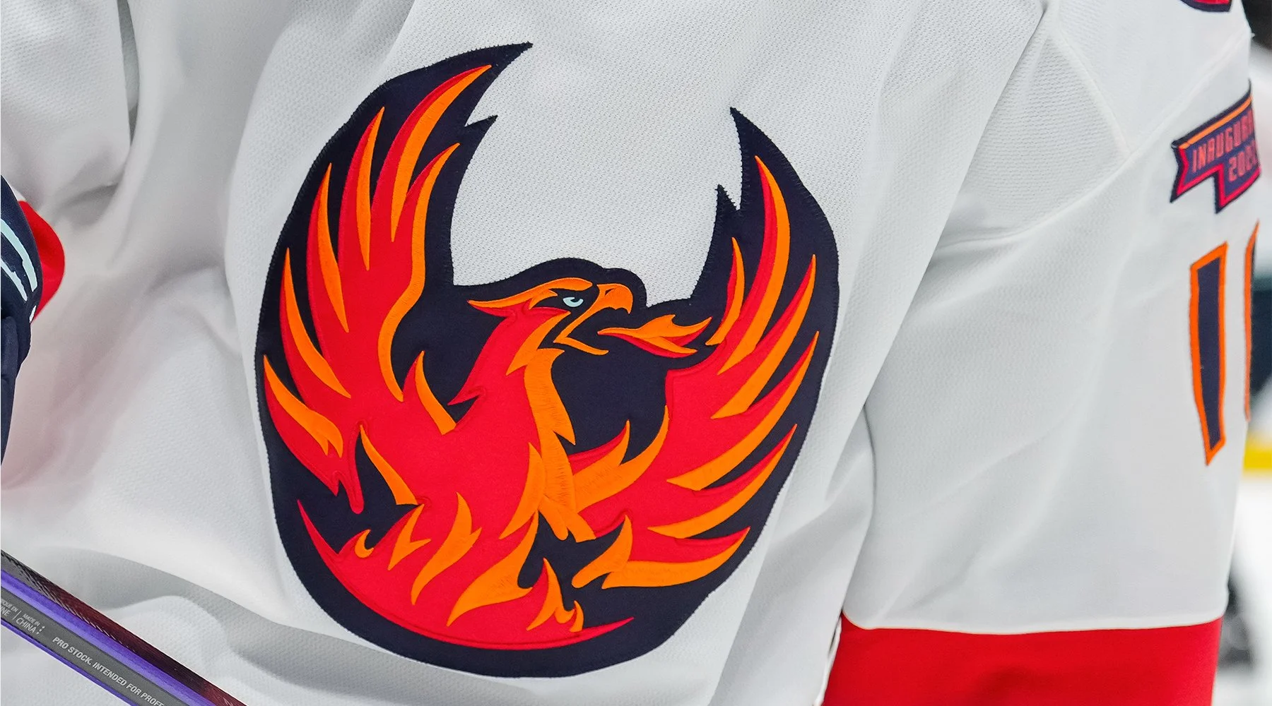
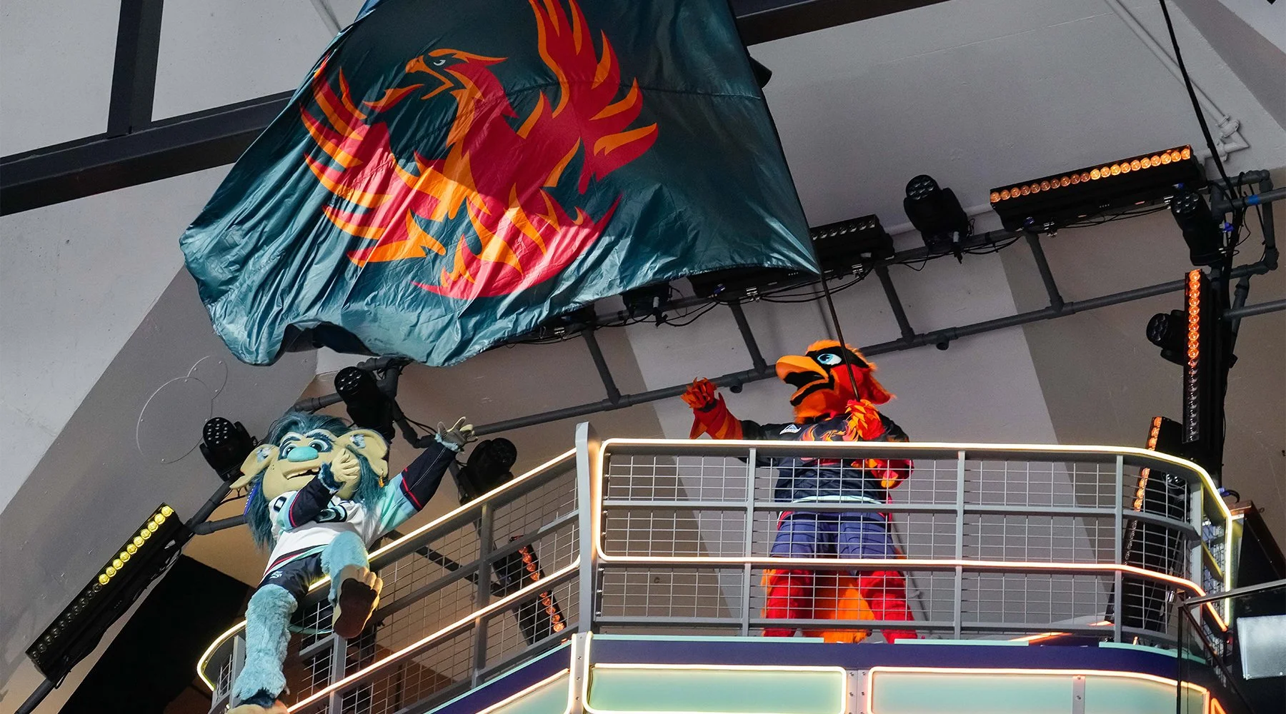
Calling the team the “Firebirds,” the organization wanted to create an identity that would share some characteristics of the parent organization, while at the same time being able to stand on its own and be emblematic of the local area.
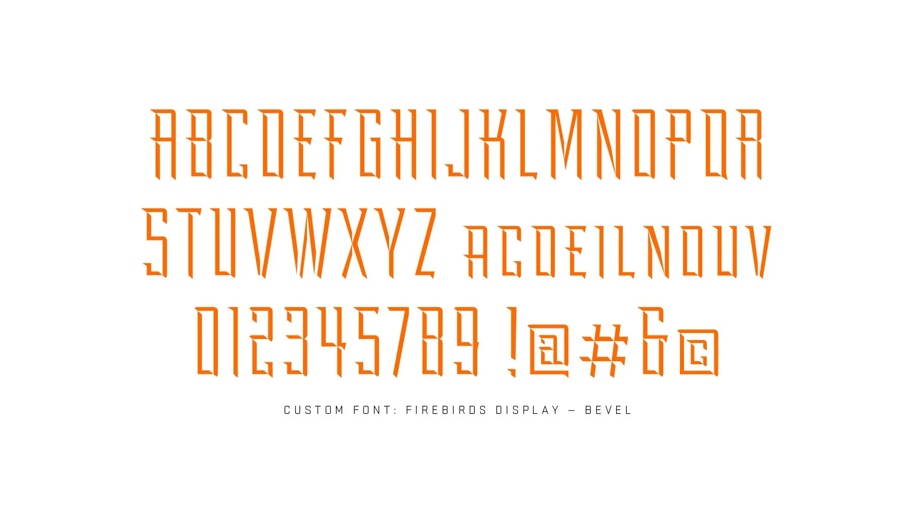
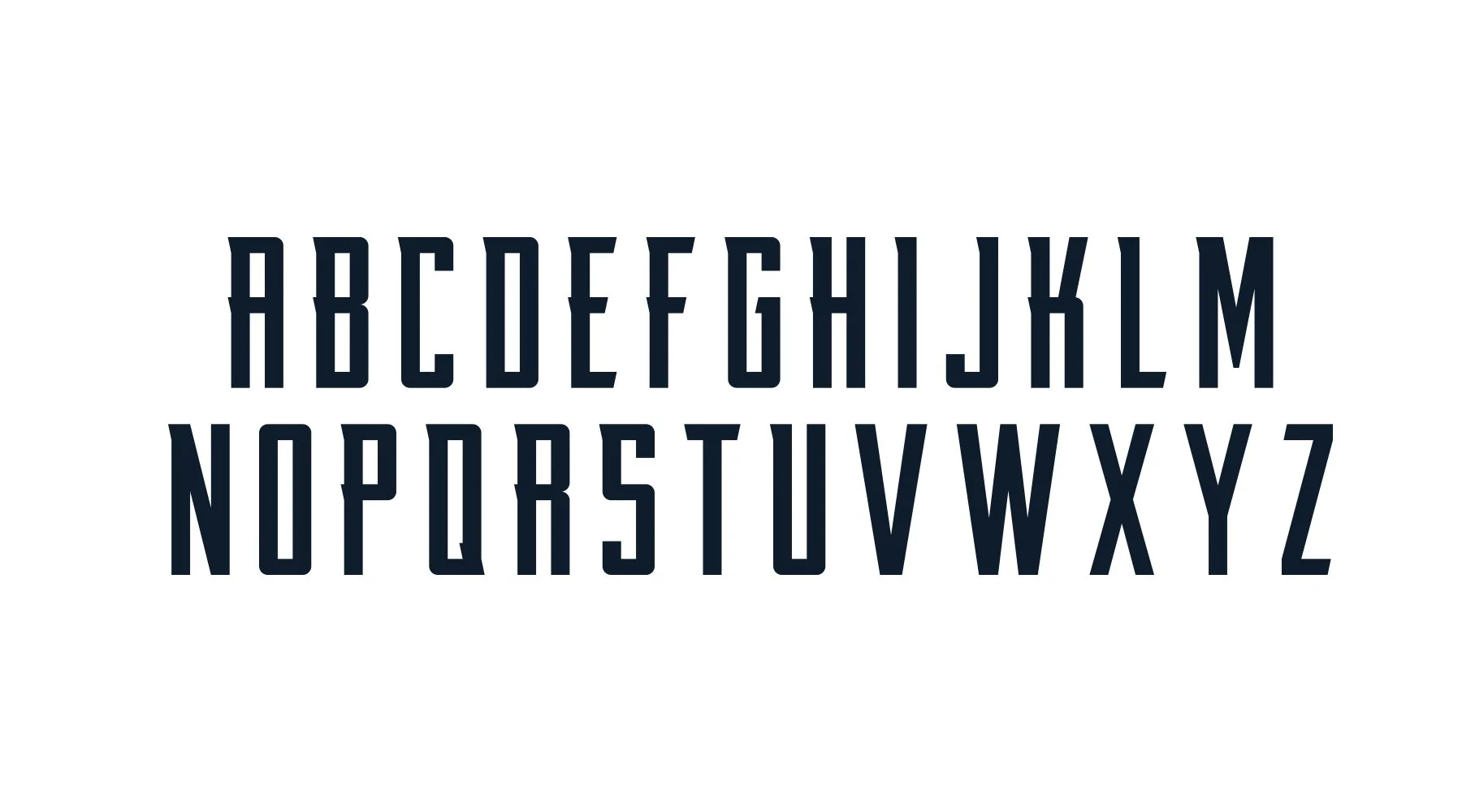
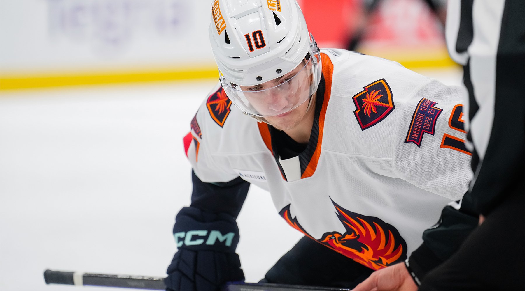
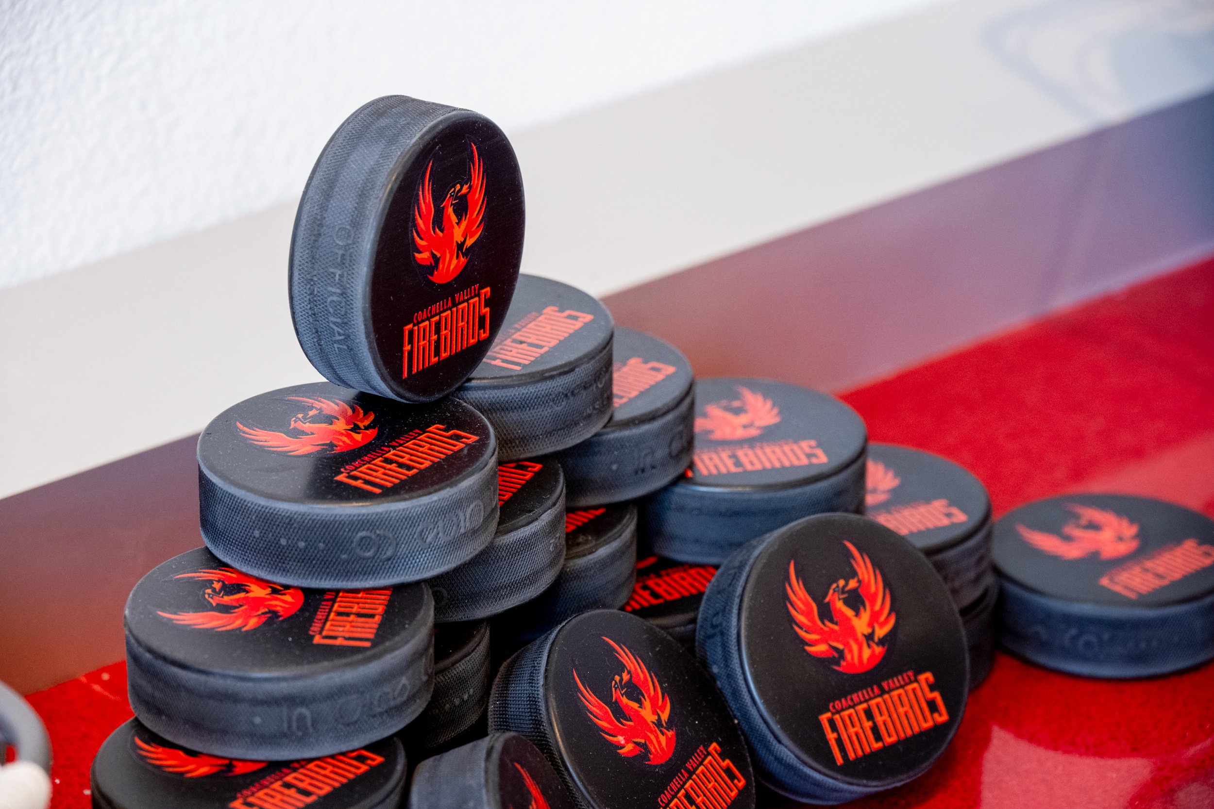
We turned to a mythical Phoenix bird as the central thematic focus, as a callback to the mythical Kraken that the team in Seattle chose as its moniker. We kept the beveled design treatment in the aesthetic, particularly in the typography design. But to set the team apart on its own, we made some key decisions; primarily, we inverted the color scheme from blues to reds (maintaining the same shades as the team in Seattle for continuity), as well as creating a mid-century modern typeface for the team’s wordmark and uniforms that is iconic to the Coachella Valley and its architecture. We also developed the secondary logo to feature the iconic mountain ranges that frame the valley, which also has a palm tree with 9 fronds on it — one for each city in the Coachella Valley.
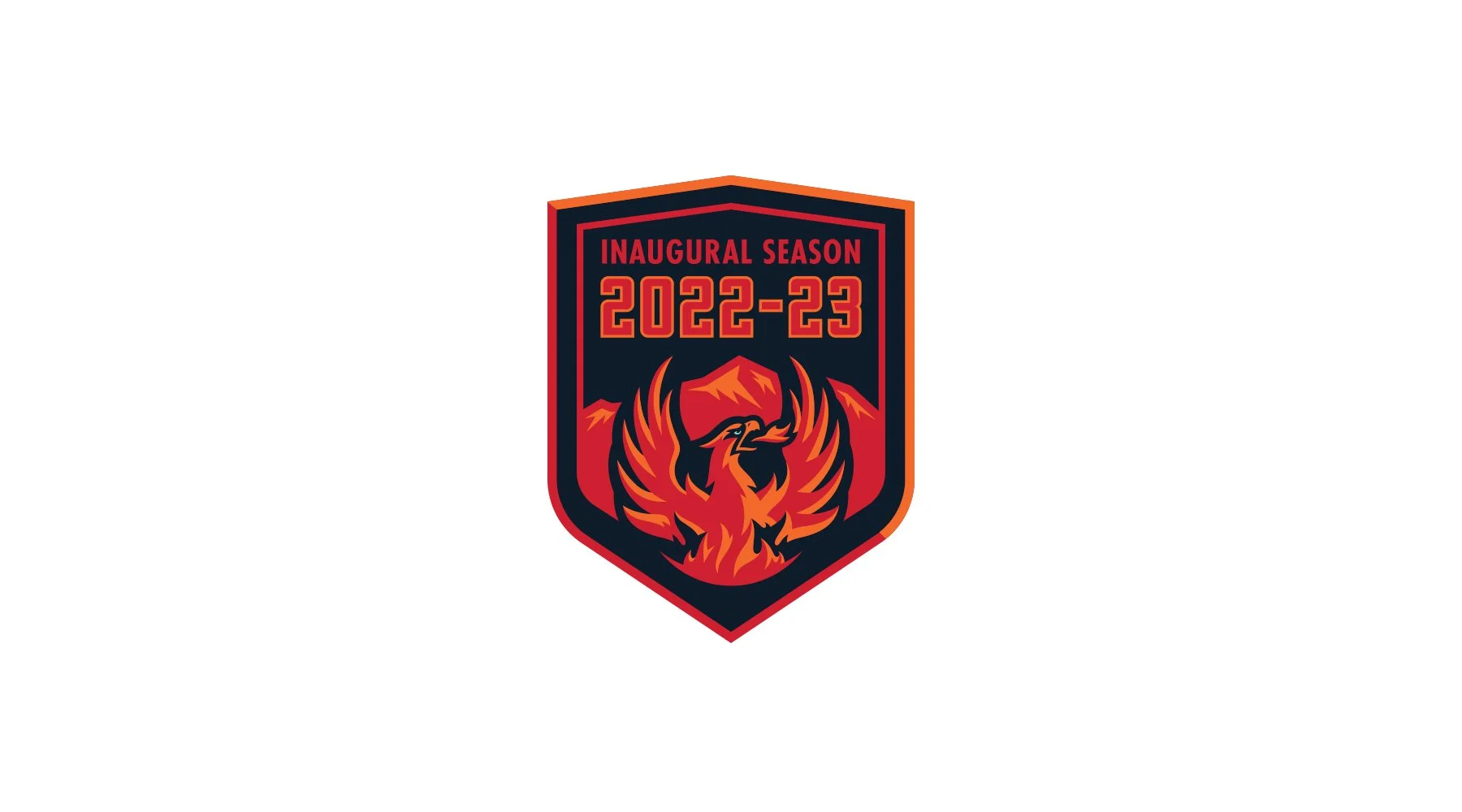
The Firebirds will take the ice for the first time in the 2022/23 season. For more information, visit cvfirebirds.com/2021/11/05/ahls-32nd-franchise-takes-flight-as-name-logo-and-colors-revealed/