San Diego Padres - 2020 Rebrand
BROWN & GOLD IS BACK
Scroll ↓
PAST, MEET PRESENT
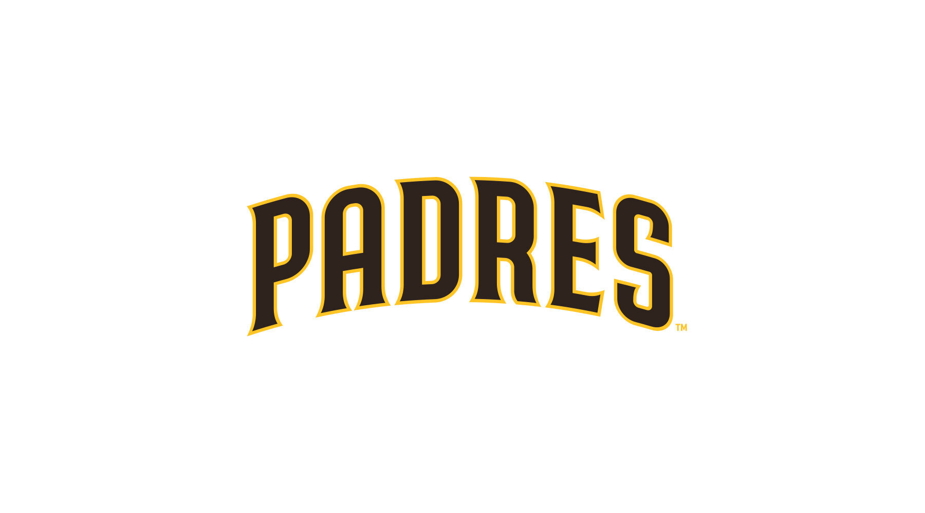
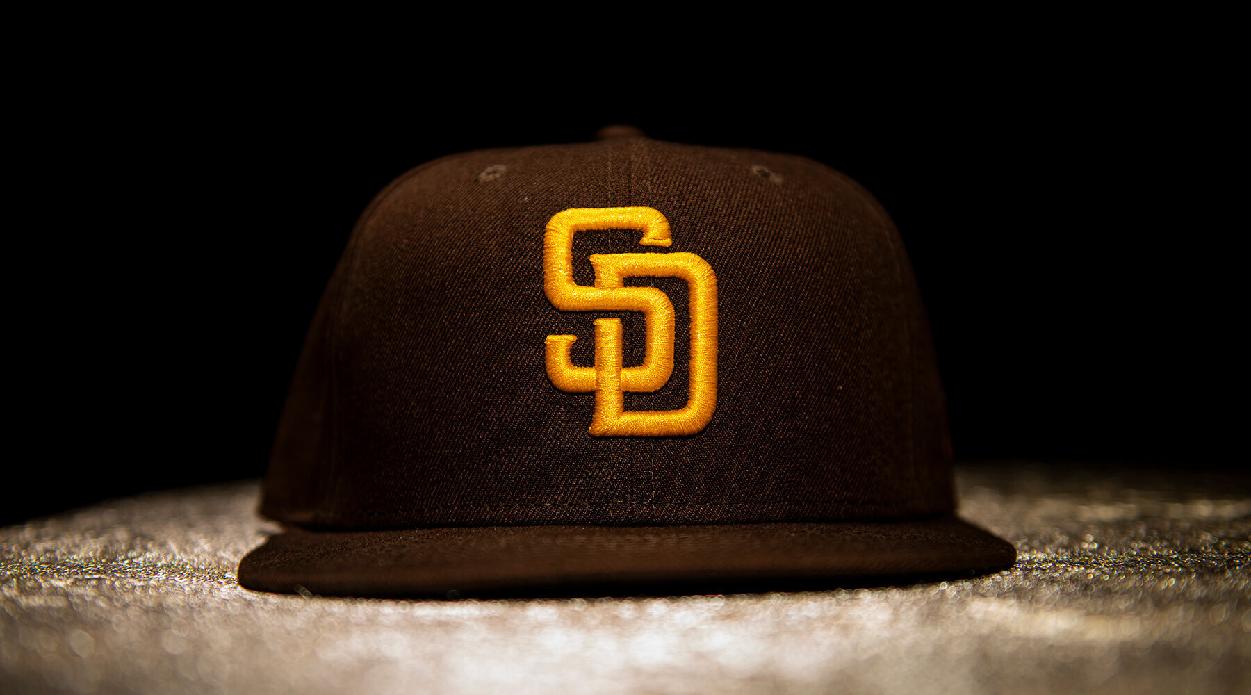
In March of 2019, the San Diego Padres reached out to me to ask me to look at their wordmarks ahead of the 2020 Nike x MLB takeover, along with the club’s return to their classic brown and gold color scheme.
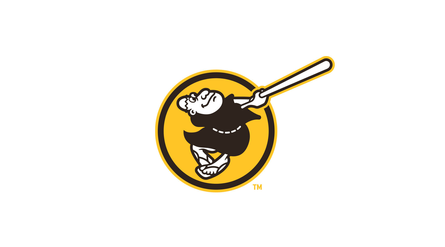
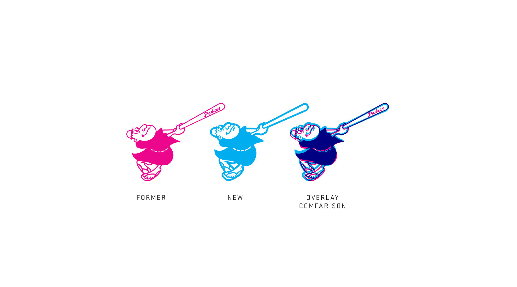
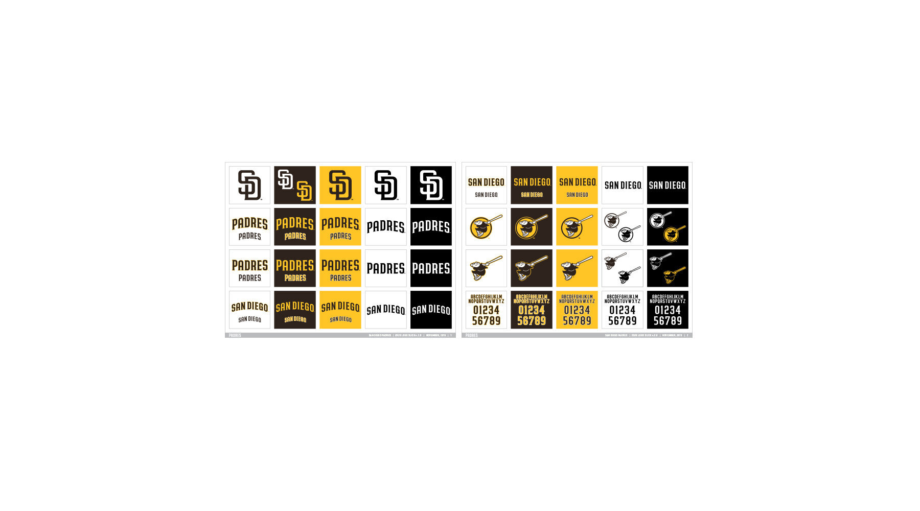
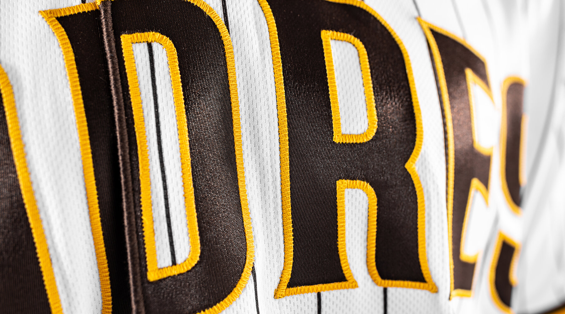
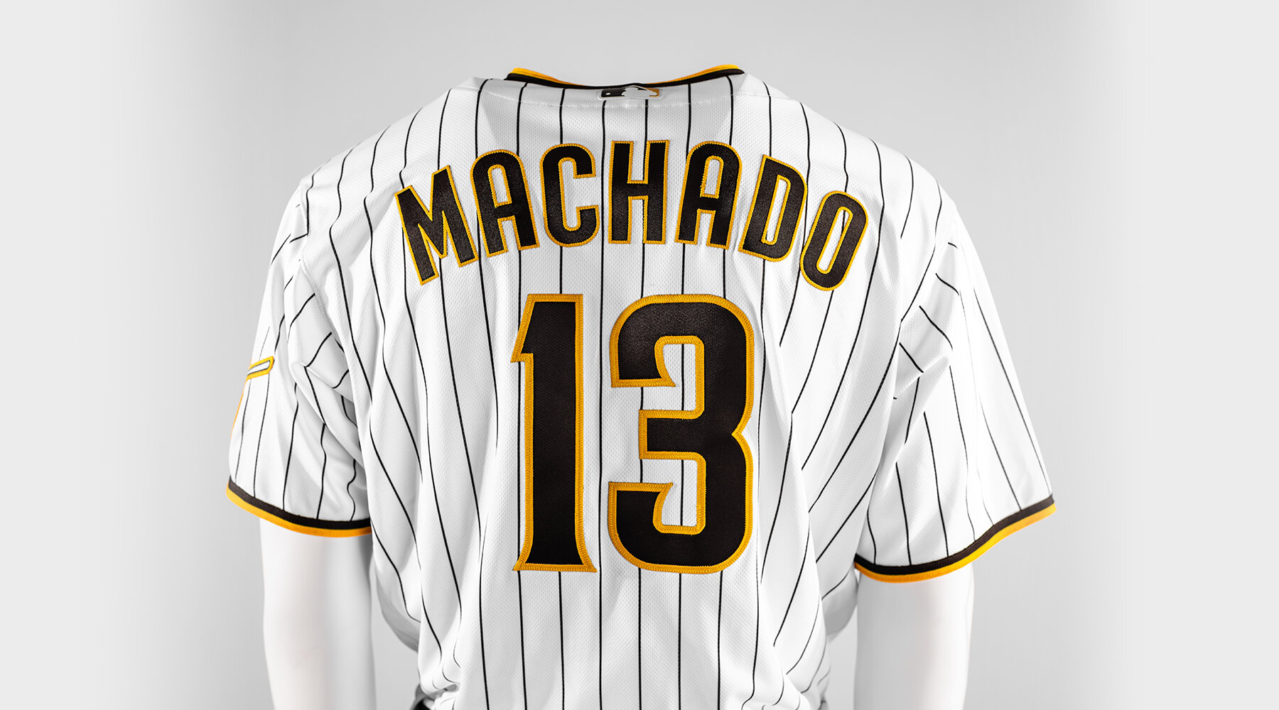
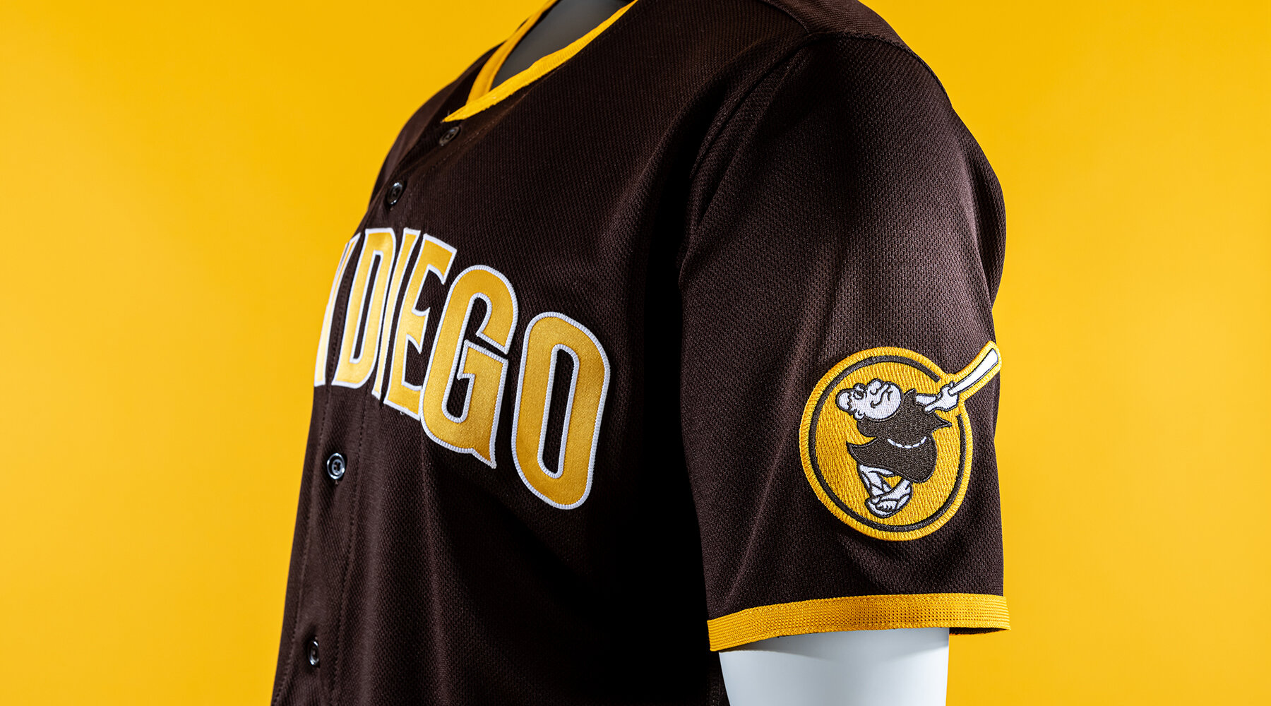
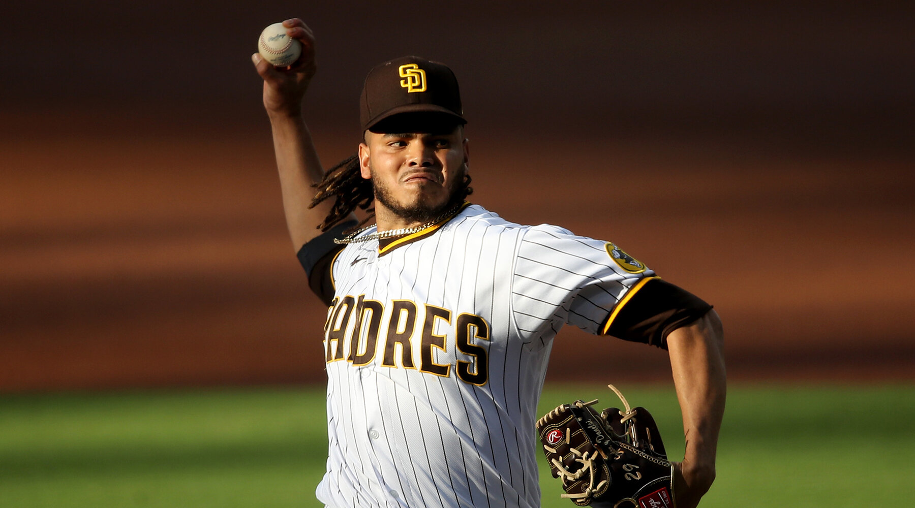
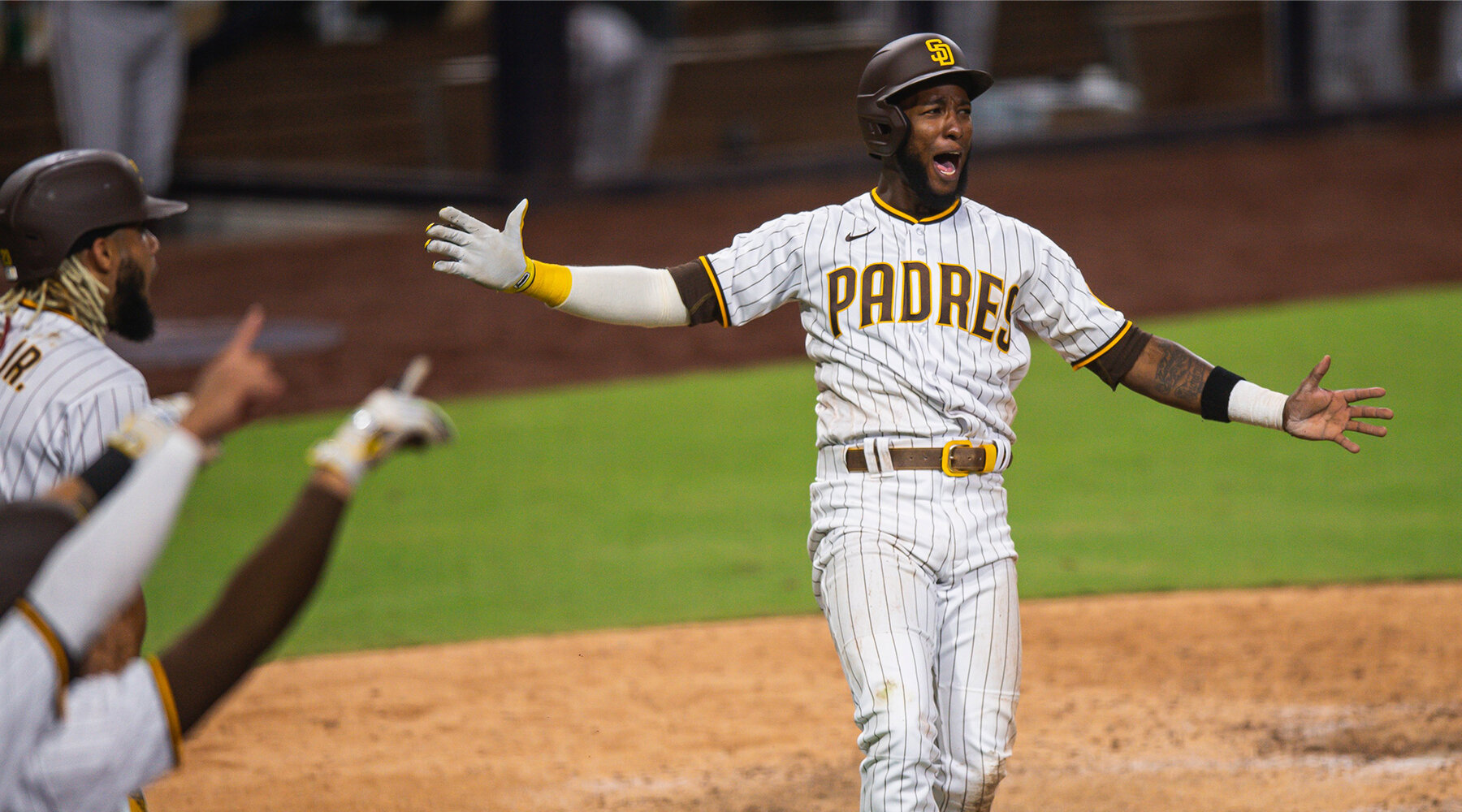
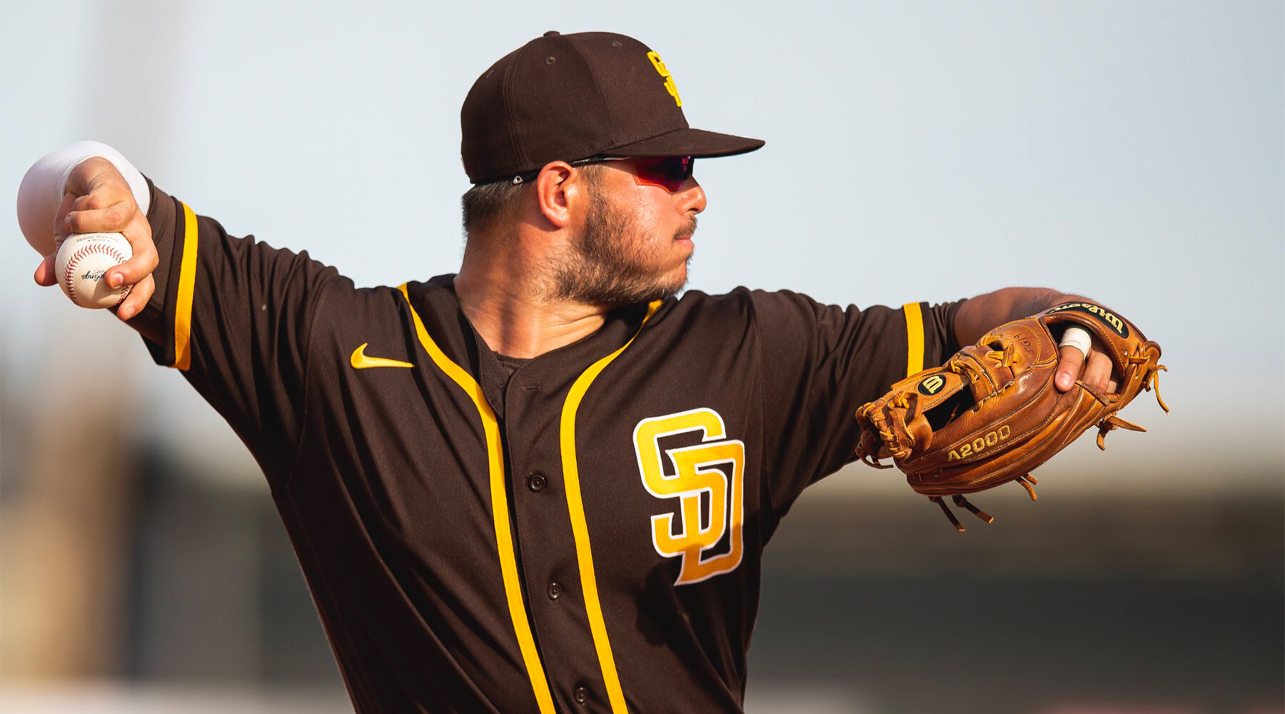
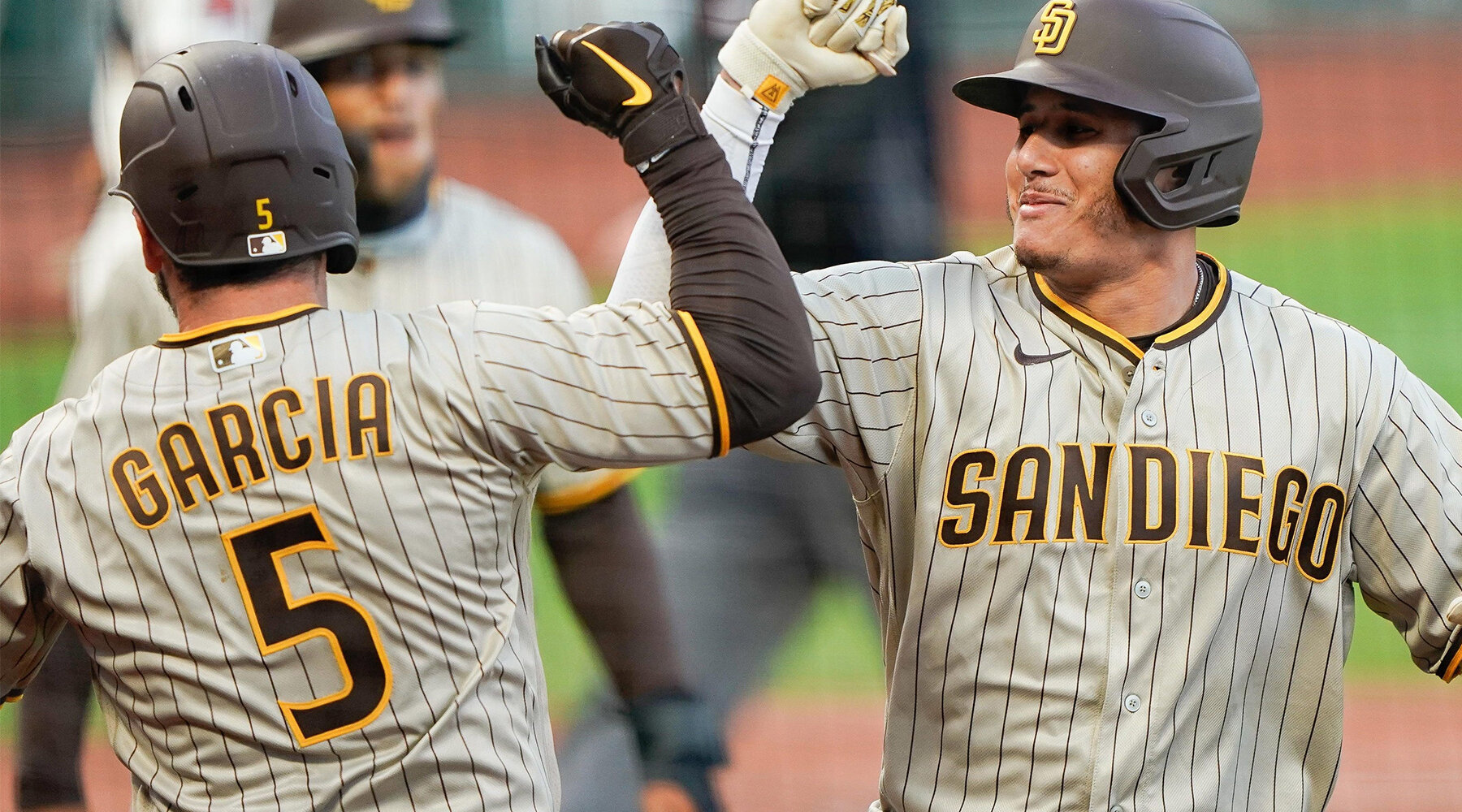
The initial brief was to take the Padres 1972 wordmark and the 2012 wordmark and create a hybrid between the two. After creating the initial type design, we took a closer look at the entire brand family, and quickly determined a full rebrand was in order. Over the next few months, I developed the new Swingin’ Friar sleeve patch, which carried over the updated Swingin’ Friar I created for the team’s 50th anniversary logo. I also created a brand new, custom name and number typeface for the uniform, which was then extended to a custom headline font for the team to use.
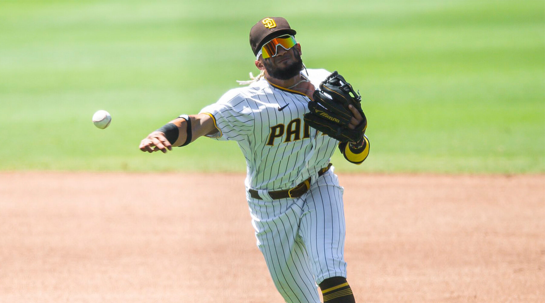
The entire brand family and new uniforms, developed by the club’s internal creative department, debuted at Petco Park on November 9, 2019. All photos displayed here are courtesy of, and copyright of the San Diego Padres.